Introduction to framing
|
|
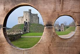
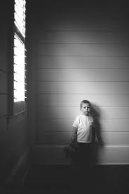
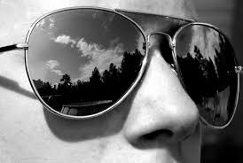
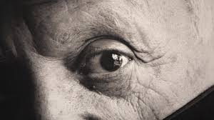
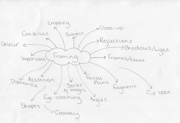
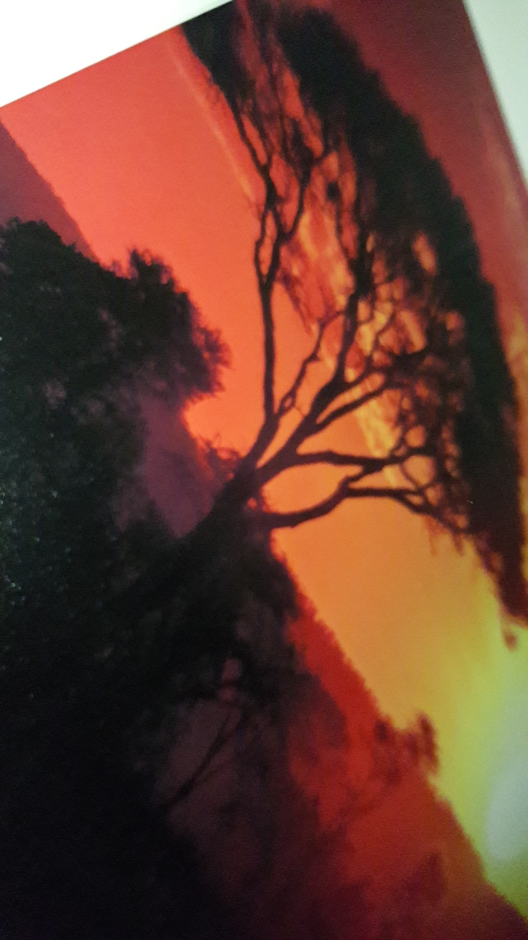
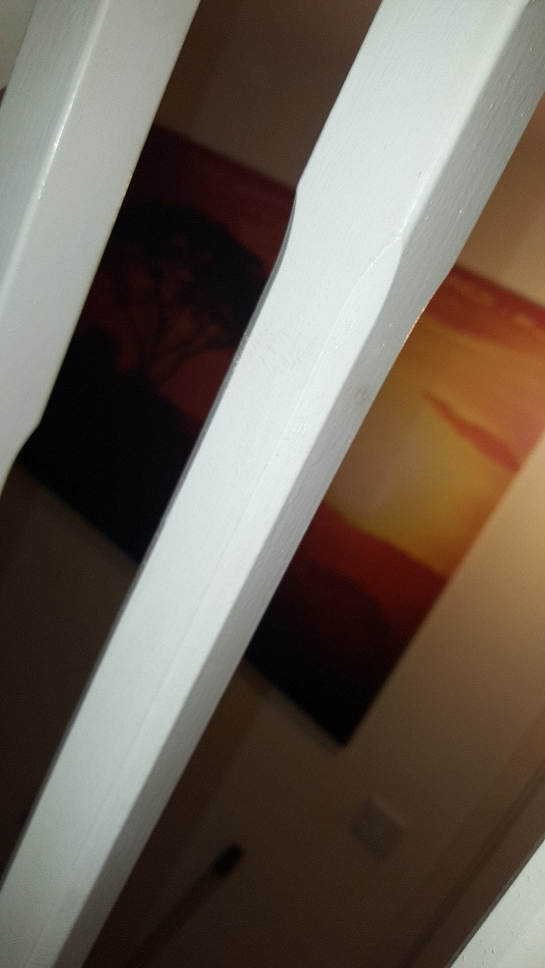
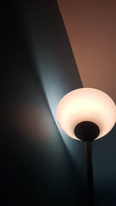
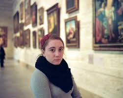
Framing is defined a technique used to bring focus to the subject of an image. The pictures here are images defined as three different examples of "framing". (showing the subject through a mask, using light and shadows and using reflections). I chose this theme because I wanted to explore the different ways I could present framing in a way that is personal to myself.
|
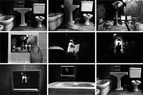
dUANE mICHALS
|
This series of images are taken by Duane Michals. His images are taken in groups, and they make a series of images that all link together. I like this images and wanted to look further into this photographer because I loved that the first and last images are exactly the same, which puts the collection in a constant loop. This photographer gave a me some ideas for outcomes because each image is taken from a different perspective of the same scene.
|
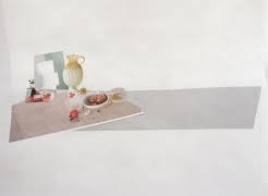
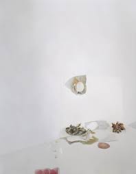
laura letinsky
|
|
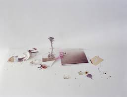
Laura Letinsky is a photographer best known for still-lifes. I really admire the simplicity of the composition of the art.
She also uses light and shadows as an important part of her work. Light can be used in framing because shadows are used to highlight because of the contrast is creates for the viewer. I like the way this artist completely differs from the others I chose because all of the different approaches can be linked. |
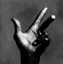
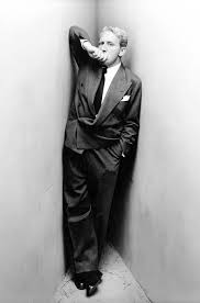
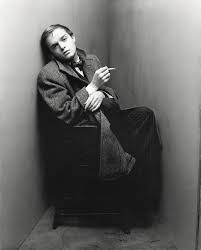
IRVING PENN
|
|
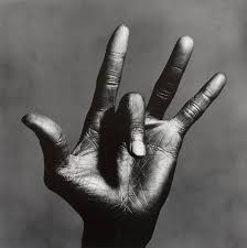
Irving Penn focuses primarily on the human body. His photography is "framing" because the extent of his cropping forces the person looking at it to focus on a specific body part. I've noticed that a theme throughout Penn's images is that he focuses on mouths, lips and hands. I want to explore how he positions the camera and/or himself to create more interesting angles. Im also interested in the way he uses colour. Some of his images are bright and full of colour, while others are black and white with the colour focused in one place. I want to make colour and angles a key part of the framing.
|
Further research
|
|
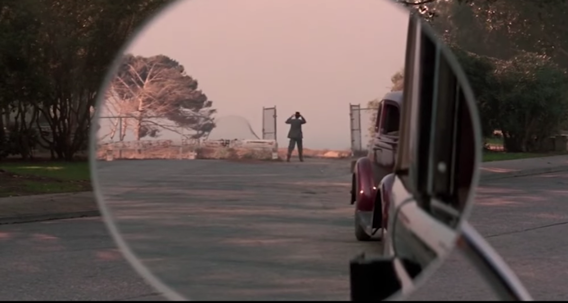
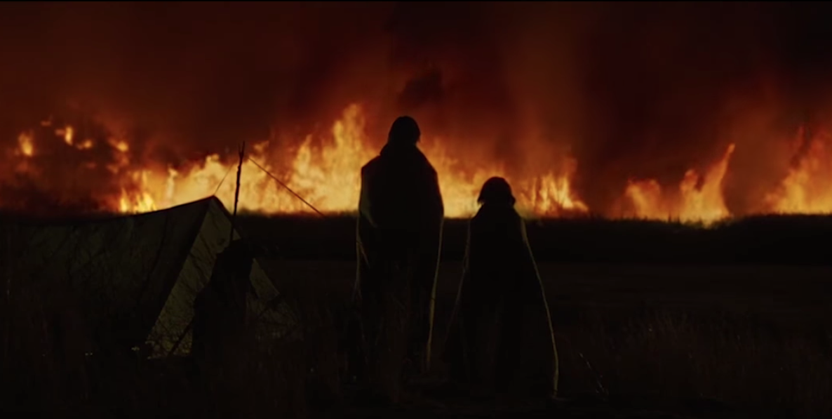
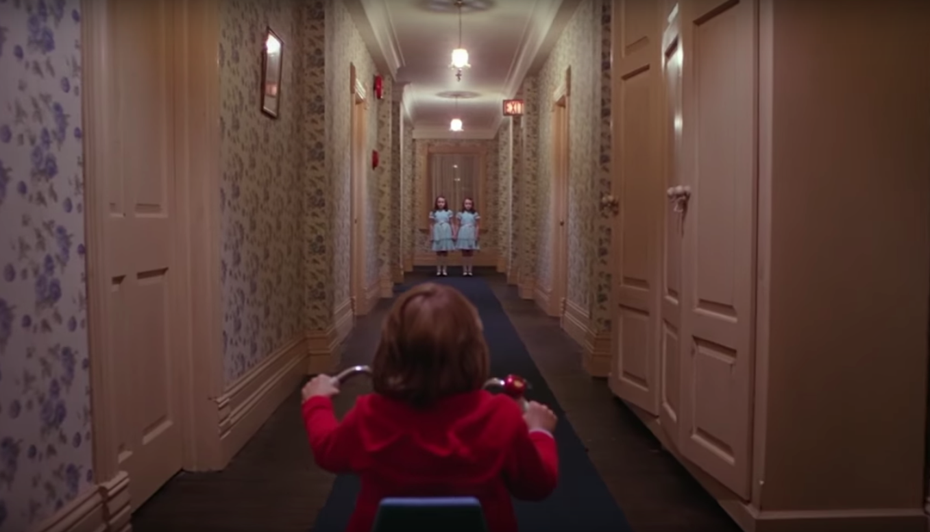
I thought of other ways that framing can be presented, and I found a video showing some of the most iconic shots in film throughout history. I found that some of the best shots ever presented in film have a recurring theme of the protagonist or key subject of the film being in the centre, with a large landscape or very minimal background. The pictures that I preferred the most were the ones with bright colours or the movies that I knew because I don't usually stop a movie to think about the frame or shot. Looking at things other than specific artists gave me a new look at the way framing can be shown in a more abstract way, where the frame is really noticed.
|
INITIAL RESPONSE HOMEWORK


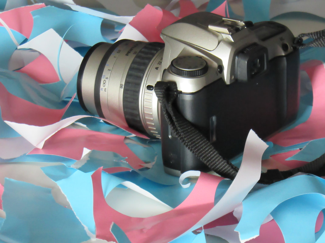
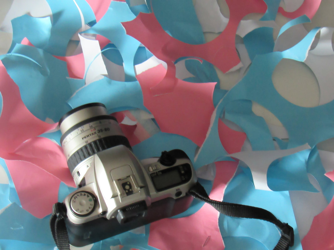
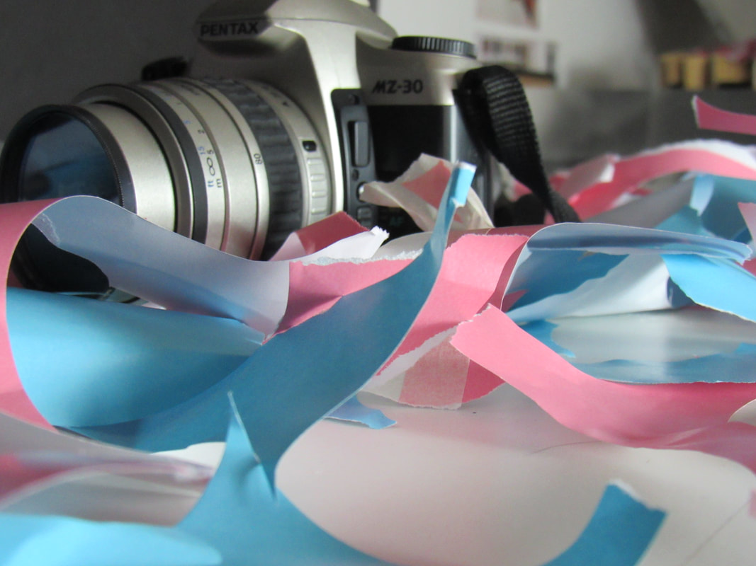
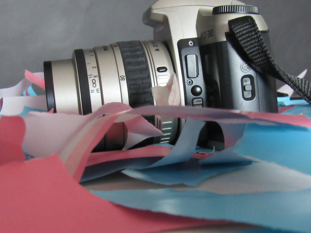
We had to start by taking 30 images inspired by our chosen subject. Mine was framing so I looked for different was to frame an image. These included, angles, cropping, colour and depth of field. I enjoyed taking these images because I could look for interesting ways to frame an image. I only found this hard to do because I didn't want take to take the images from the same angle.
|
|
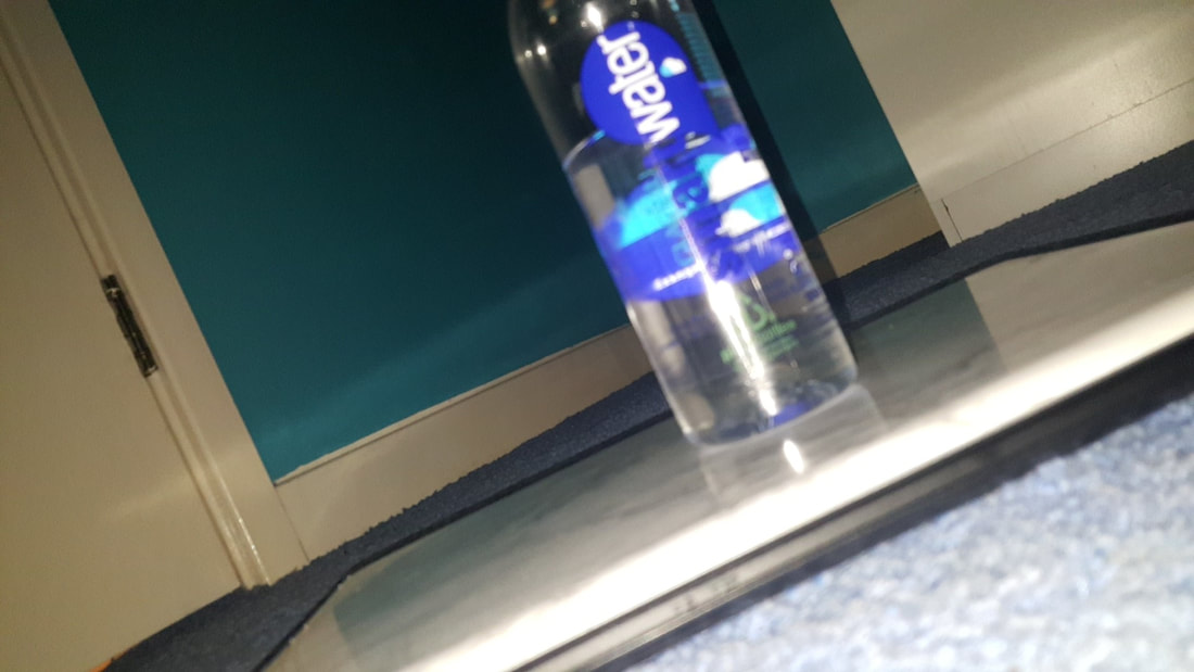
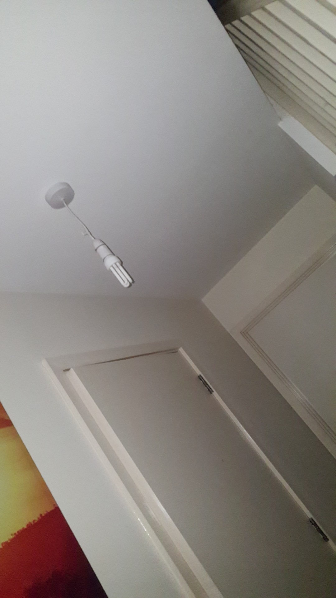
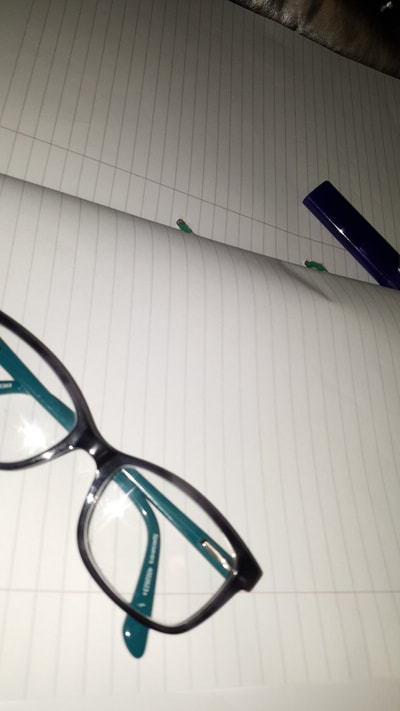
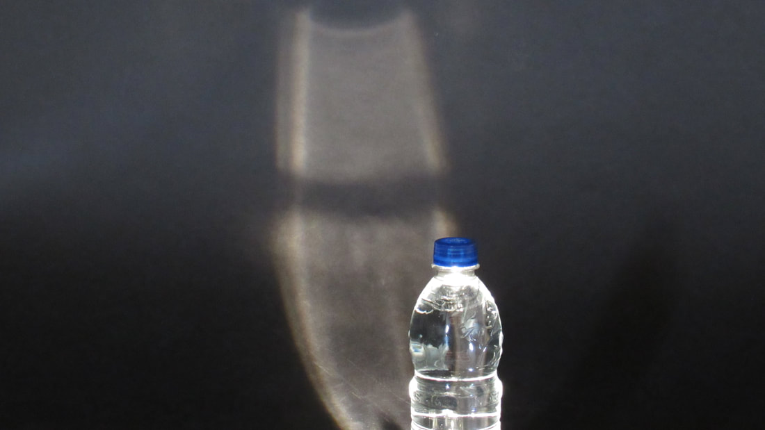
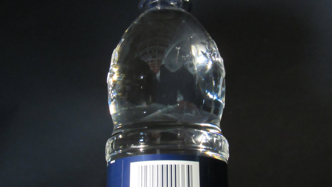
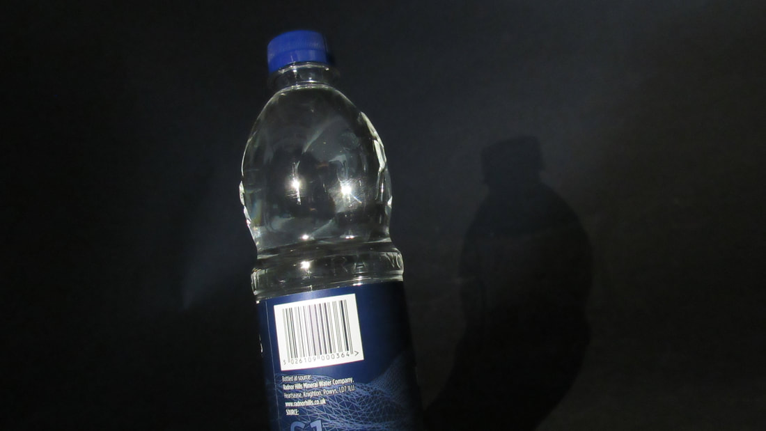
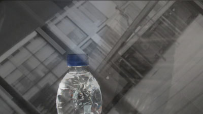
I found this first to be the most successful picture because it comes close to hitting all of the things I had on my mind map. It was taken at an unusual angle, there is a reflection to the walls and the wardrobe behind, the bottle is slightly out of focus to highlight the background and it is an extreme close up. If I was to take this image again, I would take it from a higher angle because the surface that the bottle was on has a marble print and contrasted the dark carpet and bottle label really well.
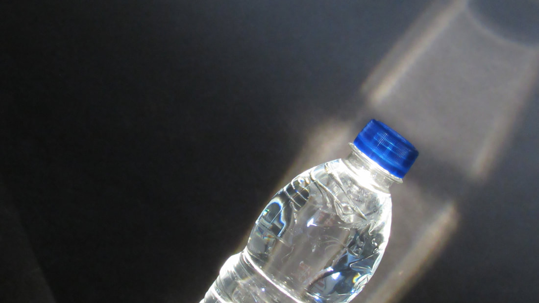
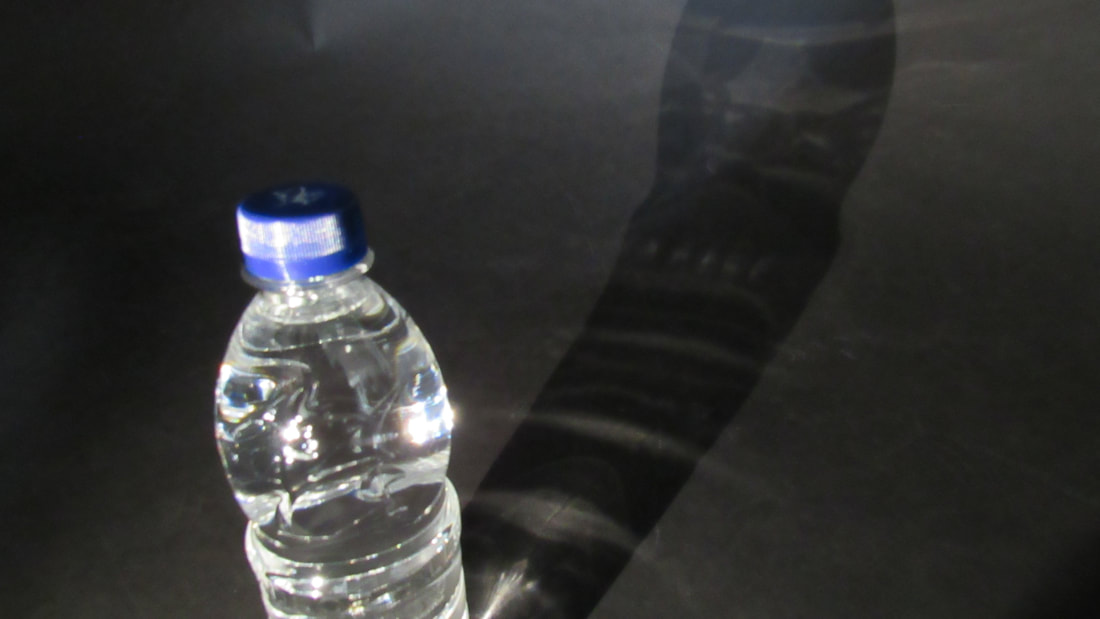
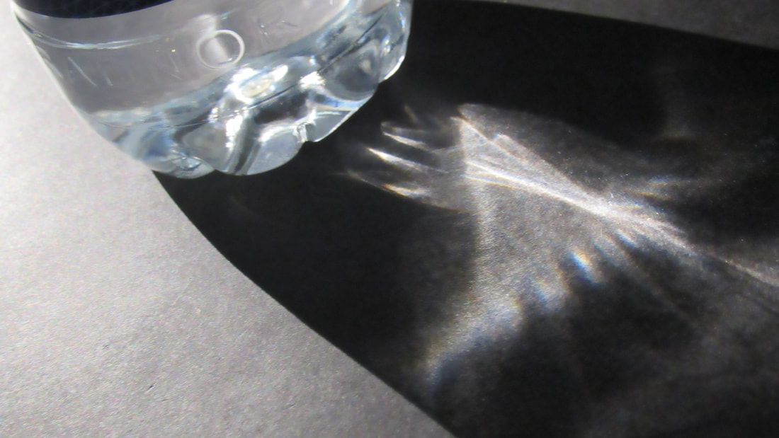
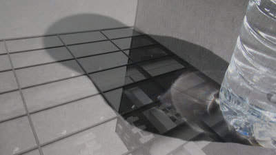
I thought the second image was successful because of the lines and the way it was taken. It shows a very clear contrast between light and dark. I chose to experiment with angles again in this image and took it from an extreme low angle. I plan to play around with this when I make my next response. I thought the third and fourth images worked well because of the use of space and depth of field.
|


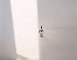
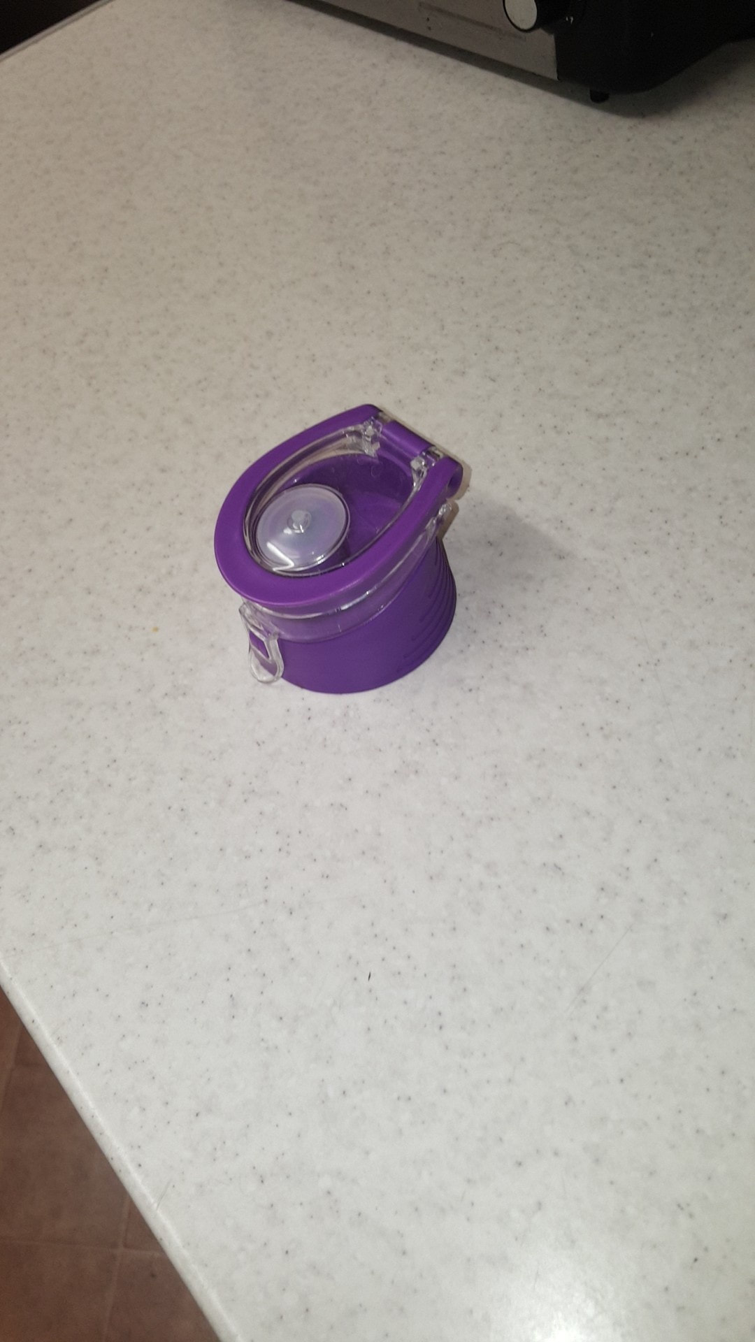
First experiment
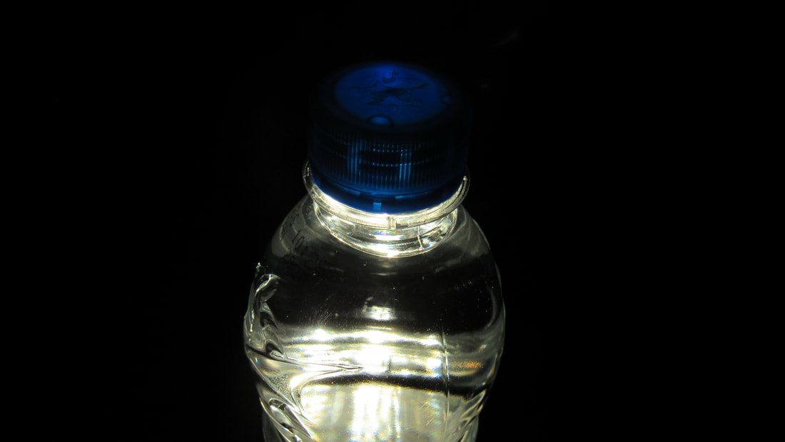
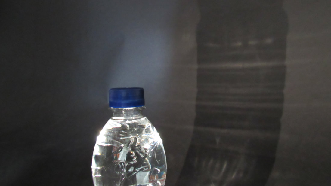
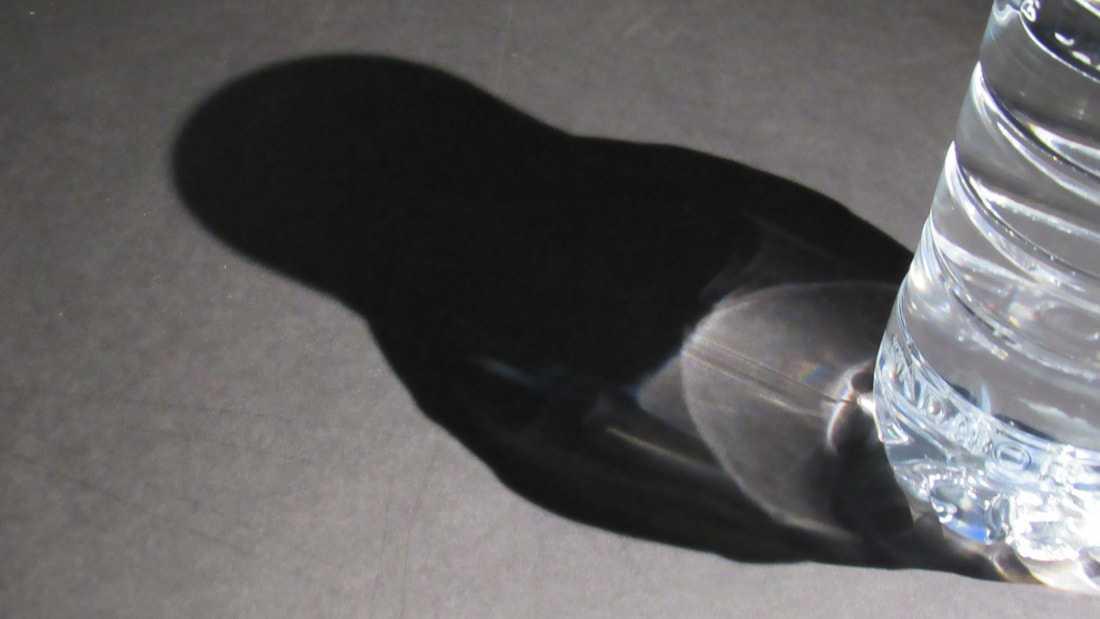
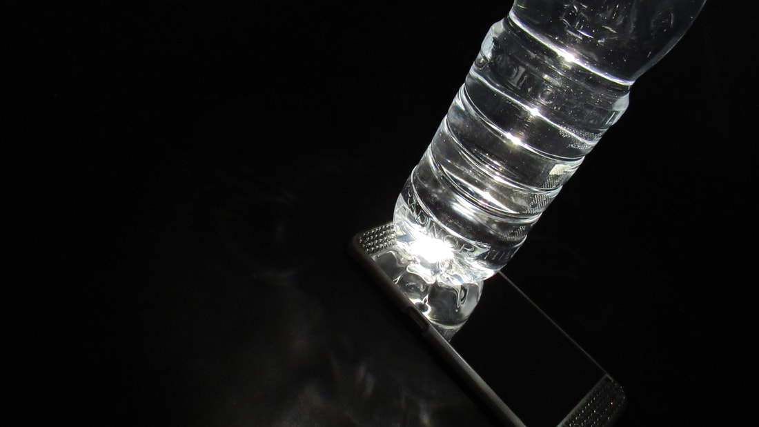
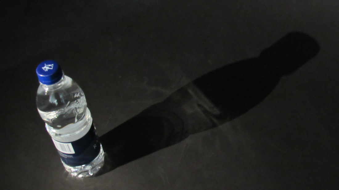
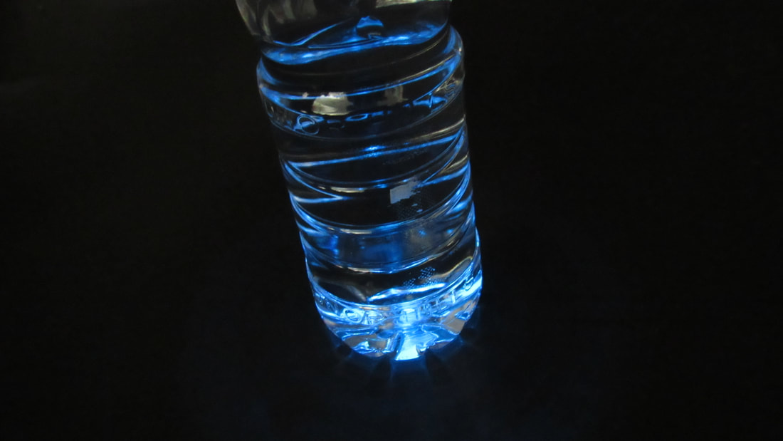
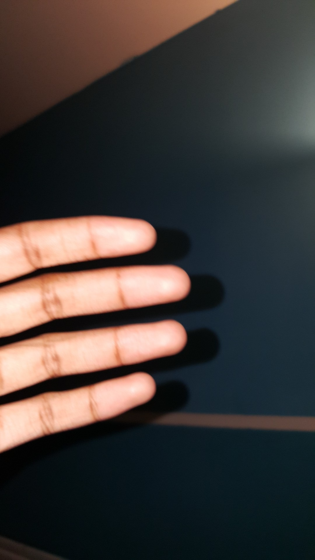
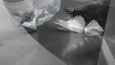
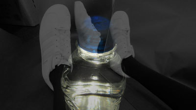
My first experiment was inspired by Laura Letinsky. Her images are all very simple, focusing on shadows and angles. When I was taking my initial response images, I thought the ones where I played around with angles worked the best, so I tried to this again, to see how many different ways there were to photograph the same subject. I used the flashlight on my phone and put it at different heights and angles around the bottle to see what shapes the light would make. One thing I found that was unique was the image where the bottle appears to be radiating a blue light. This was because the light is against the lid (which was blue) and it shone through the whole bottle. This is the most successful image in my opinion. I tried to experiment with depth of field as well, but this just made the pictures look like they were rushed.
Paolo Morales
|
|
Paolo Morales is a street photographer that I found on Pinterest. I like his images because they all show a different story, which to me is what framing is. Being able to show the ways in which something can be shown, so I think Paolo Morales and any other street photographers will be good to look at for framing. I also like that his images of normal people just living their lives, ignoring the camera for the most part.
|
my response
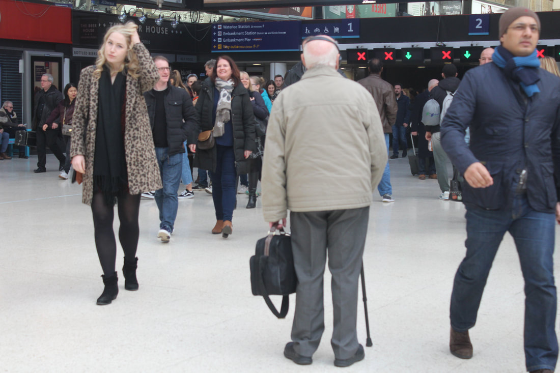
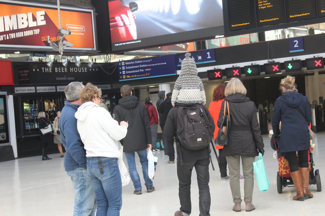
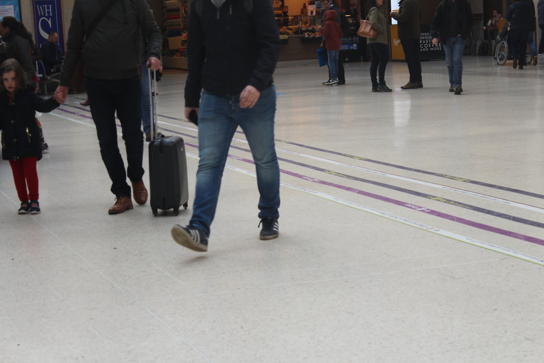
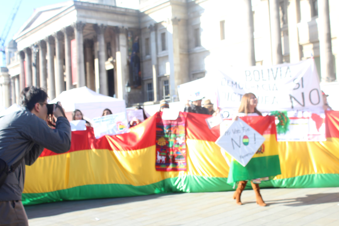

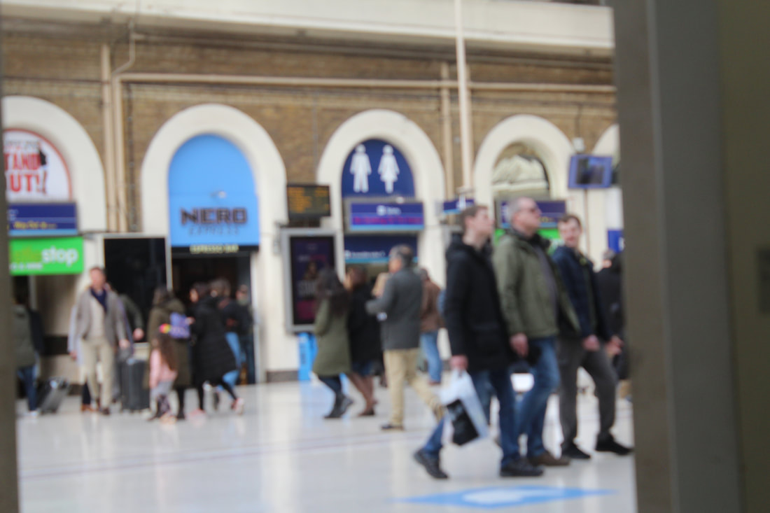
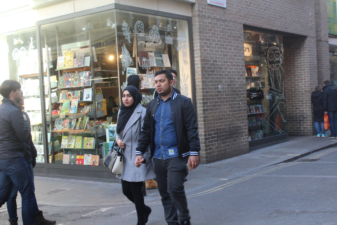
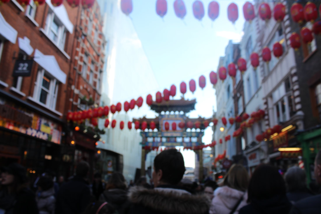
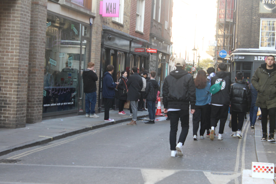
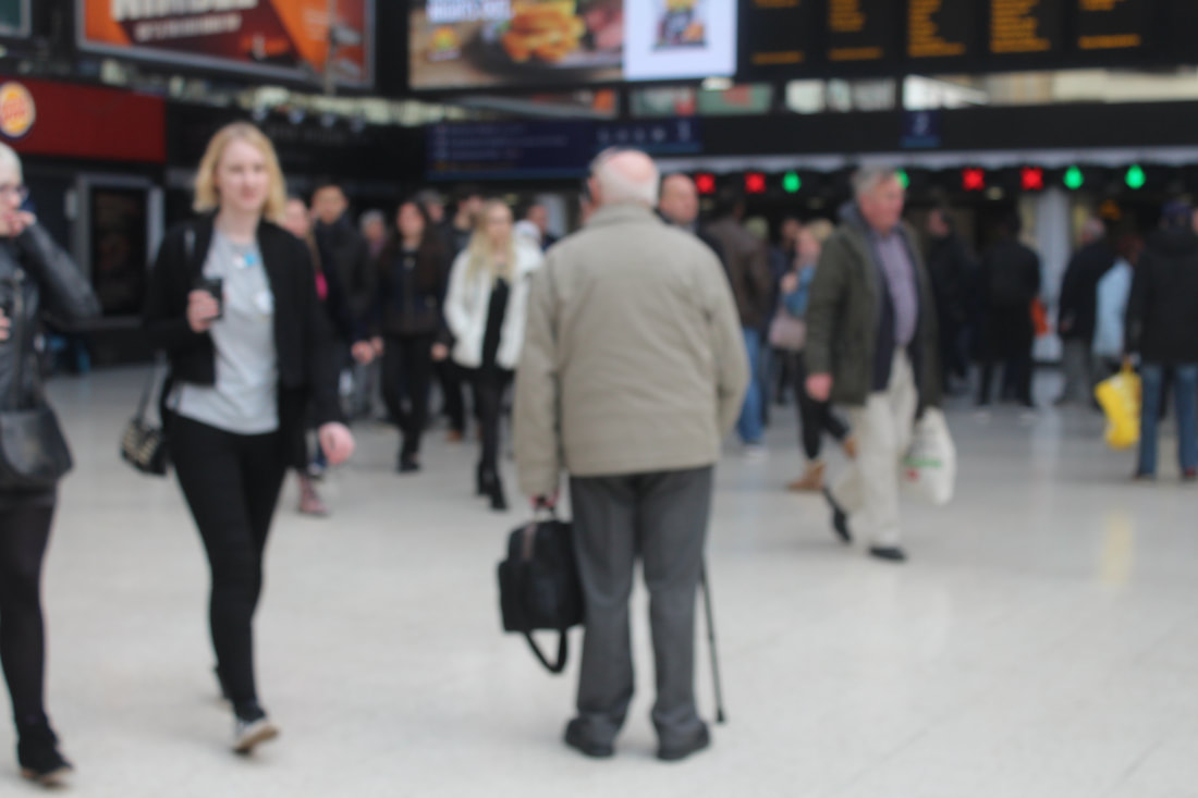
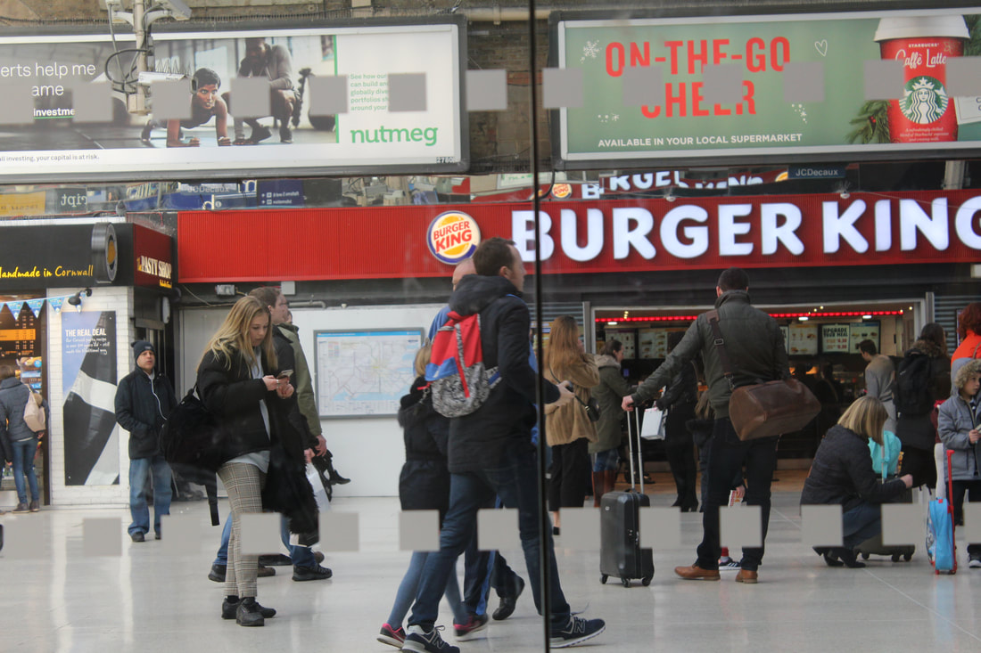
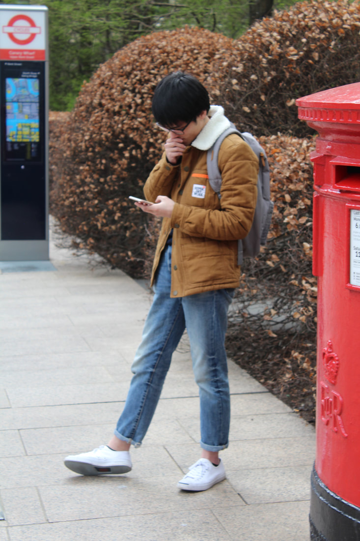
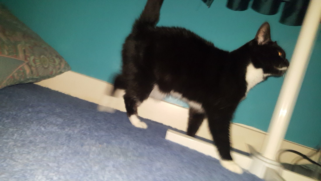
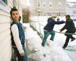
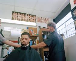
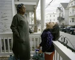
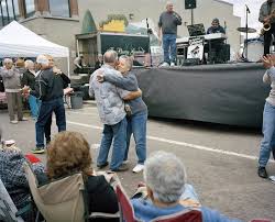
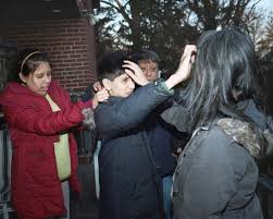
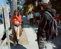
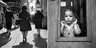
This series of images were all inspired by Paolo Morales. I think his images relate to framing because when you go out into a crowd with a camera, people tend to ignore you and only focus on what they're doing. So in my head, when I took the picture I was putting all the people in the frame with their own story. Morales has a gallery titled: "Alone In The Crowd" which was inspiration for my pictures. One that I thought was successful had an old man in a brown coat waiting for a train, and everyone around him was walking around him and ignoring. I found this to be an perfect example of being alone in a crowd.
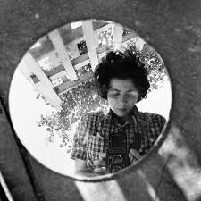
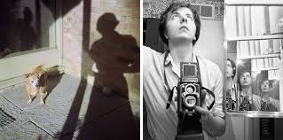
Vivian Maier
|
|
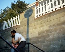
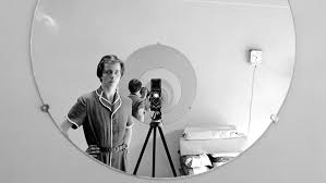
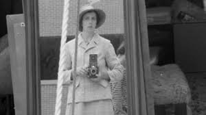
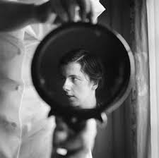
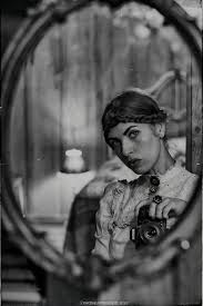
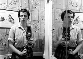
Vivian Maier is another street photographer. I chose images of hers where she focuses on shadows and reflections. I like that Maier puts herself and the camera in the images, breaking a sort of "fourth wall" between the artist and the person viewing the art. I also like that the images are all in black and white because it makes the lines nicer to look at/ cleaner.
|
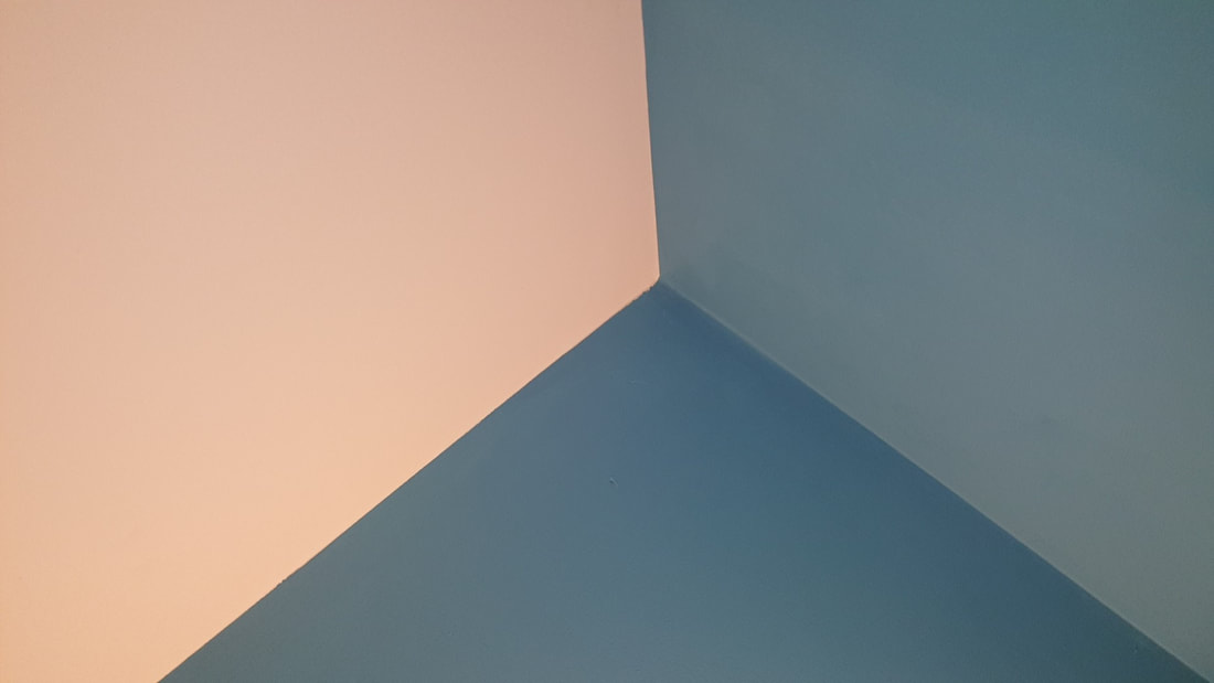
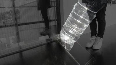
My response
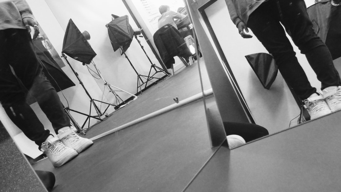
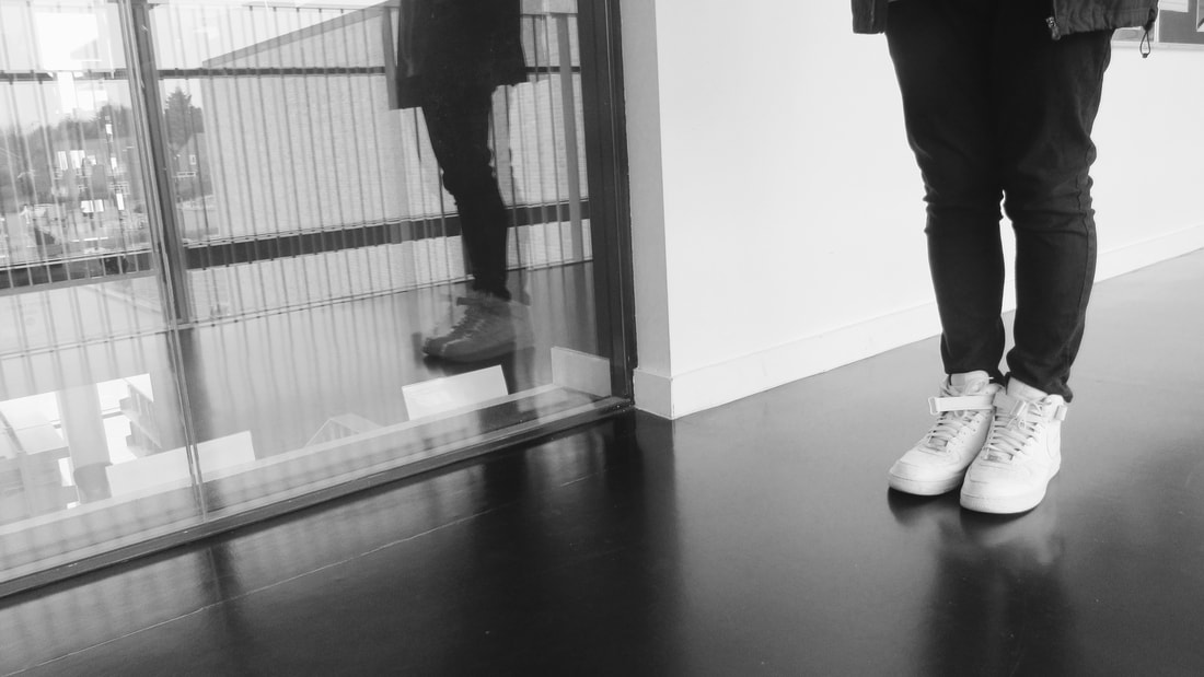
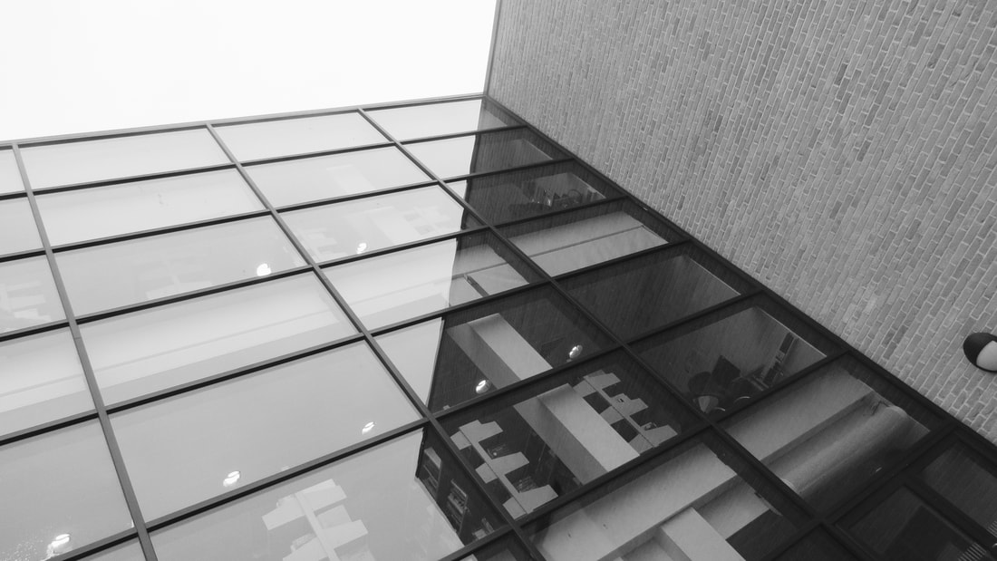
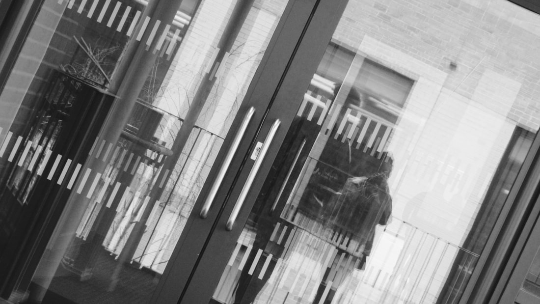
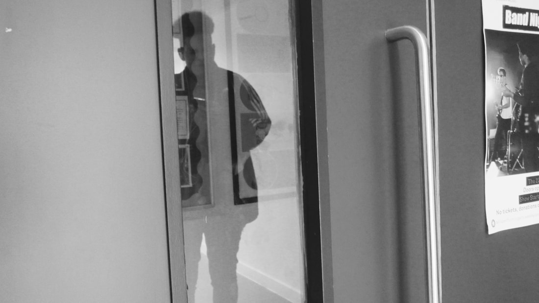
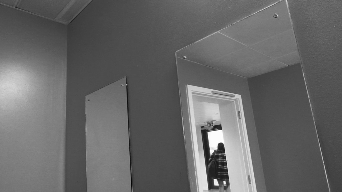
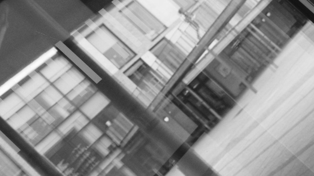
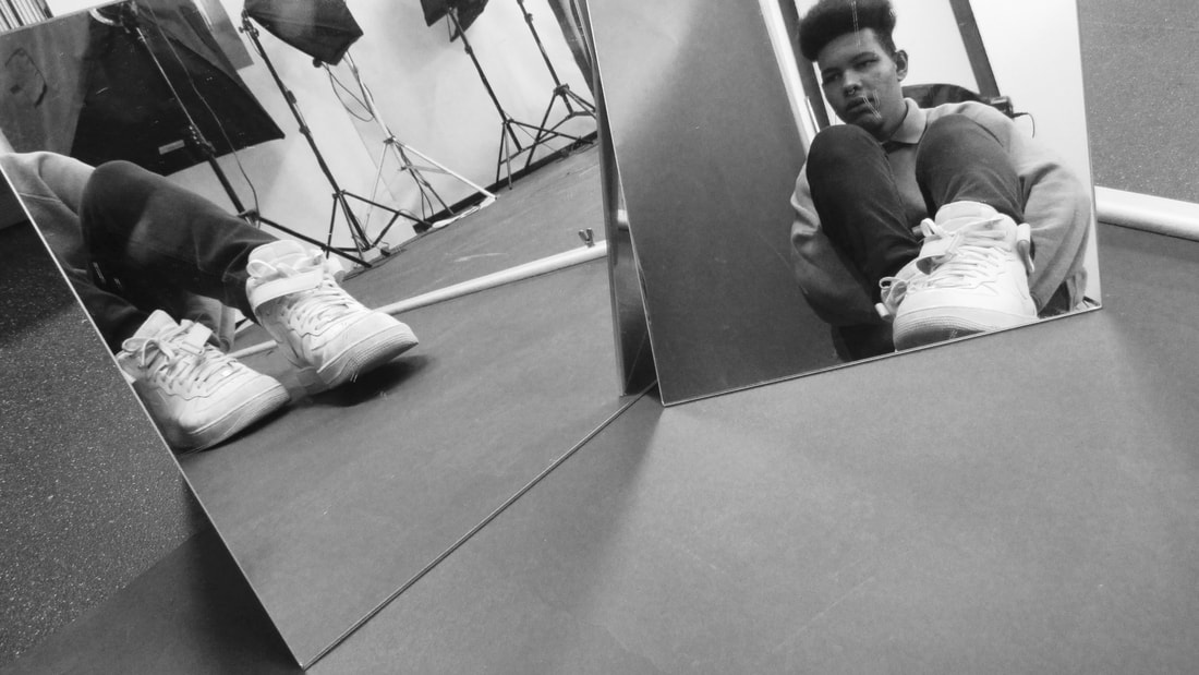
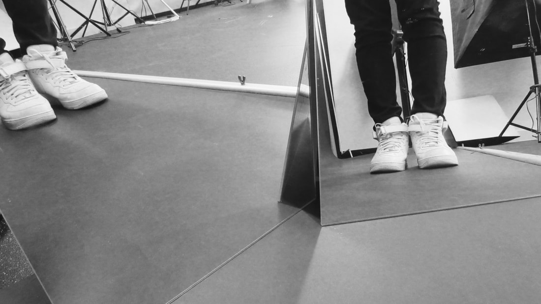
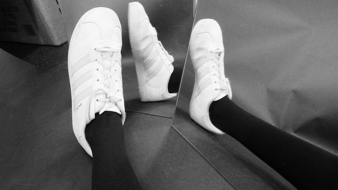
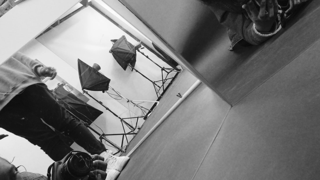
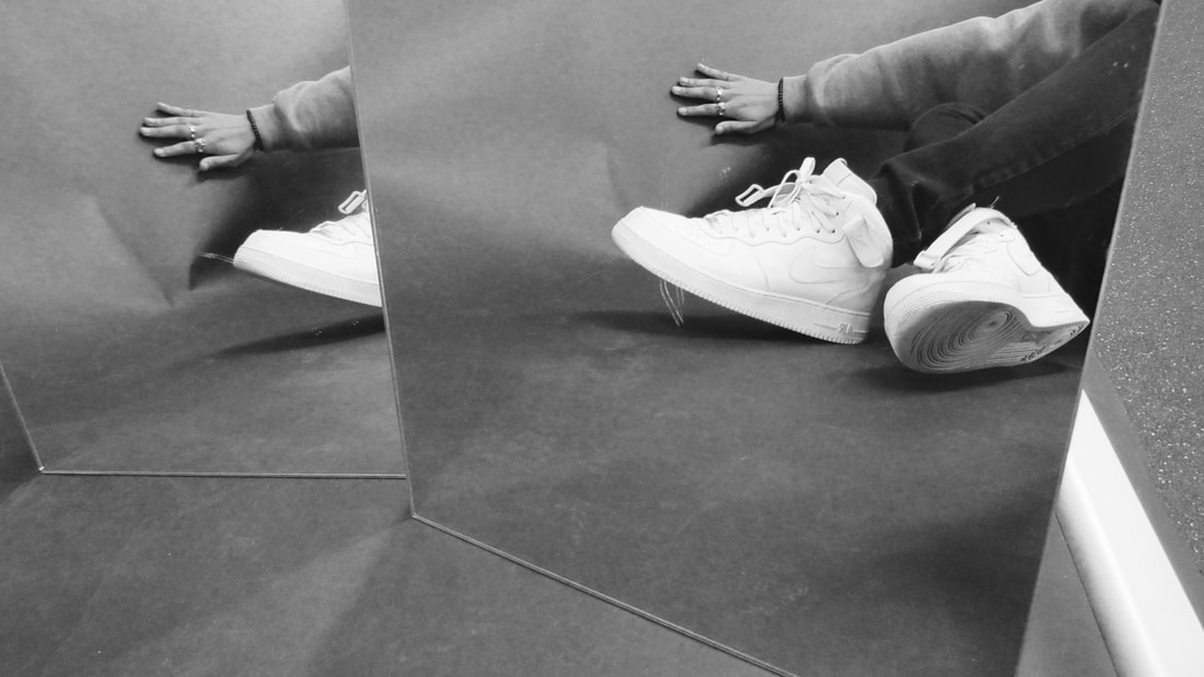
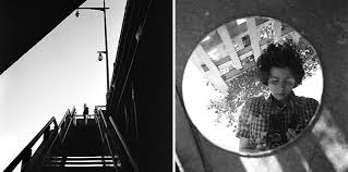
These images were inspired by the work of Vivian Maier. She works with mirrors, focusing on shadows and reflections, often having herself in the images. I walked around my school and looked for reflections. One setting that caught my eye was one from the outside of a building, where the reflections of the lines of the building seem to merge together to form a new structure.
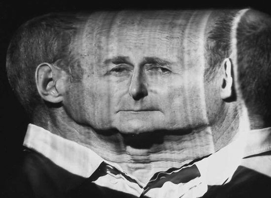
Photoshop experiment
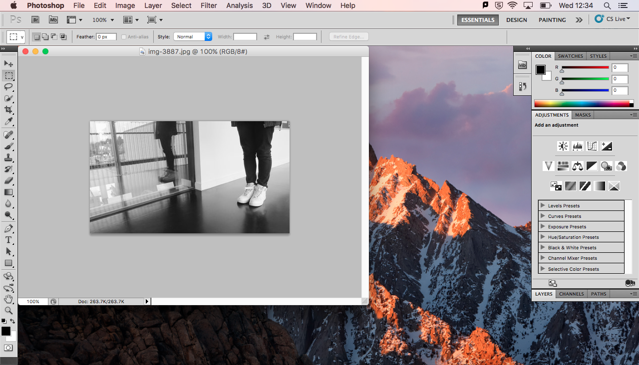
I started by putting both images into photo shop.
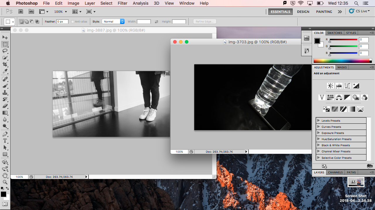
I then separated them so I could clearly see both images and used the rectangular marquee tool.
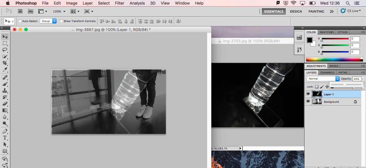
I then laid it over the other one with the move tool and experimented with the opacity until I got an overlap that I liked.
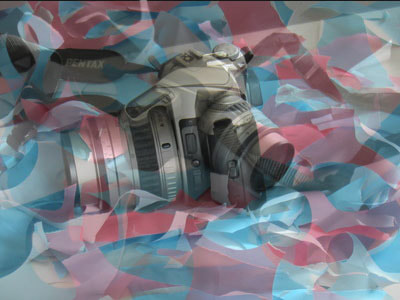
I decided I wanted to experiment using Photoshop, practicing layering photos over one another. I liked the look of both my Laura Letinsky-inspired images and my Vivian Maier-inspired images, so i chose those two sets to join to each other. It was tough at first, as I have very little experience digitally editing photos, but once I had it i enjoyed playing around with the opacity of each layer. I want to work with Photoshop again, looking at different angles or perspectives of the same subject.
Second photoshop attempt
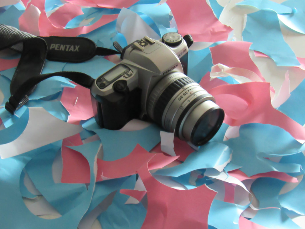
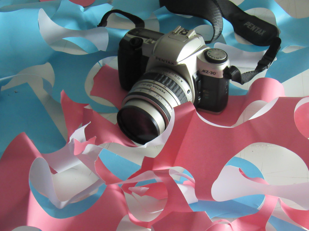
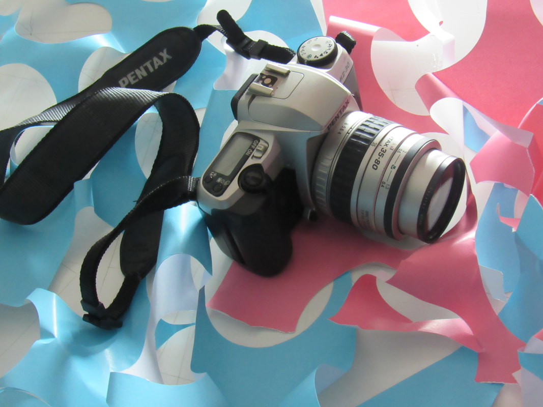
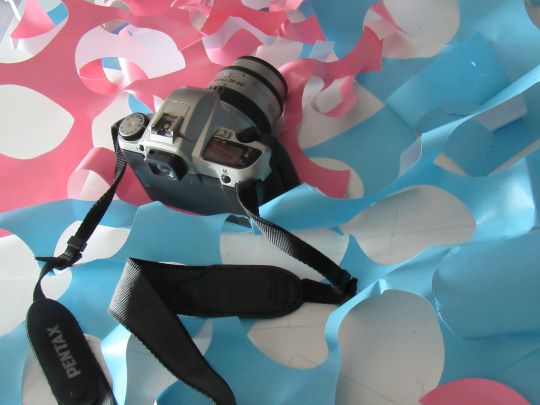
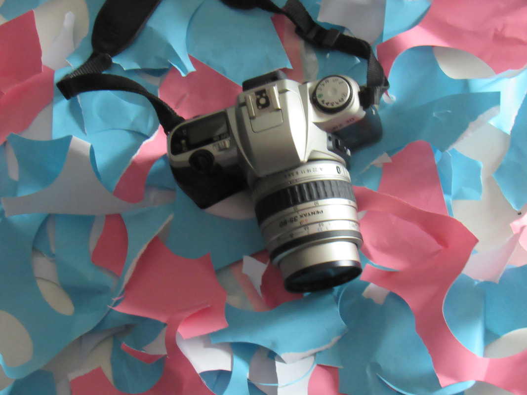
I took this set of pictures with the intention of Photo shopping them like the previous set. This was why I took them in many different angles, so I could experiment with the opacity of each layer. This was also why I wanted the pictures to be colourful, so that when they were edited, the colours would overlap and create an effect.
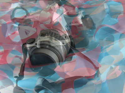
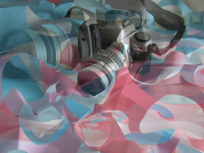
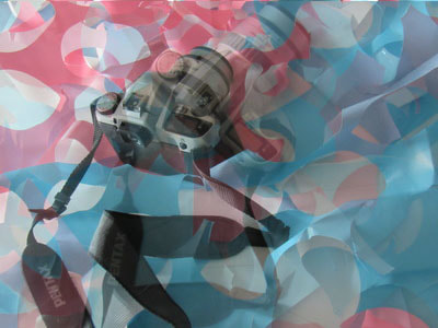
I found that, when editing these, it was a lot easier because I knew what to do, but I didn't like the outcome. I think that because the background is so busy and that the overlapping ruins the images. I probably will not be trying this type of editing again, as it worked once, but not all types of images work together in the same way.
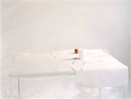
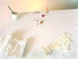
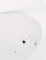
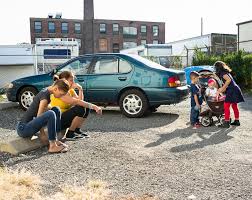
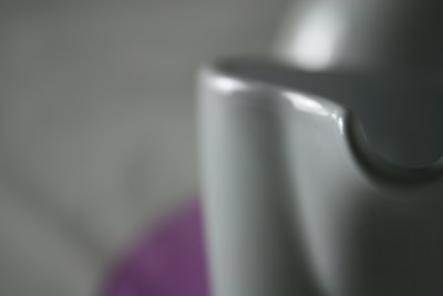
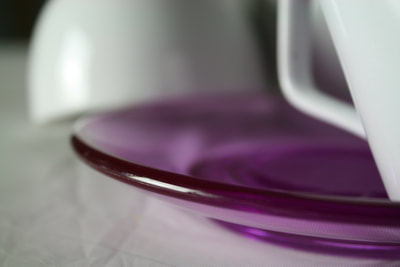
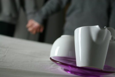
still life


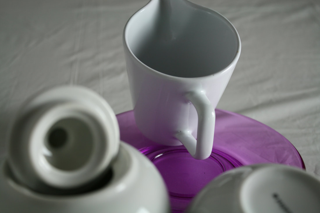
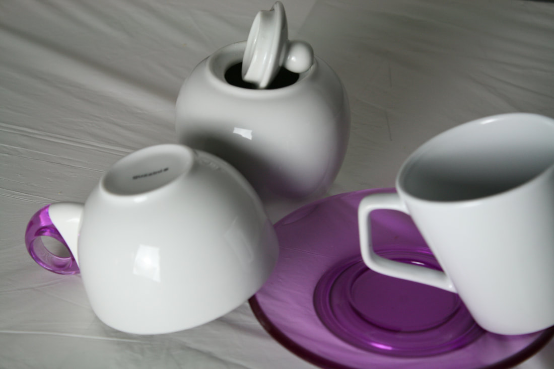
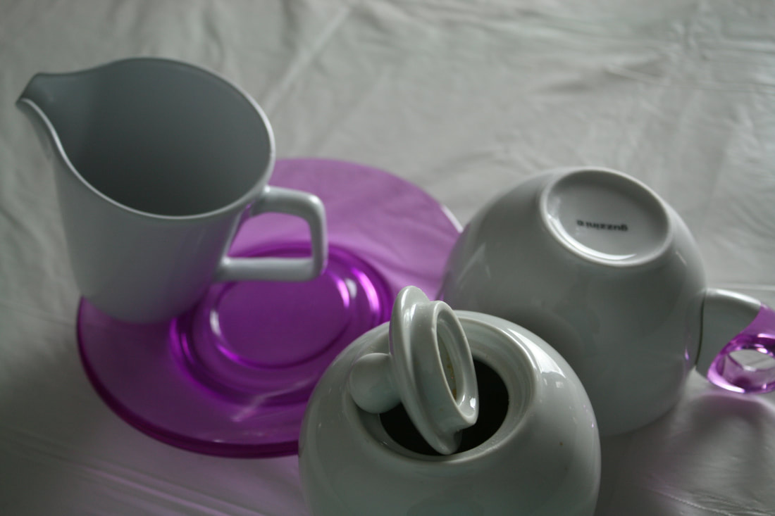
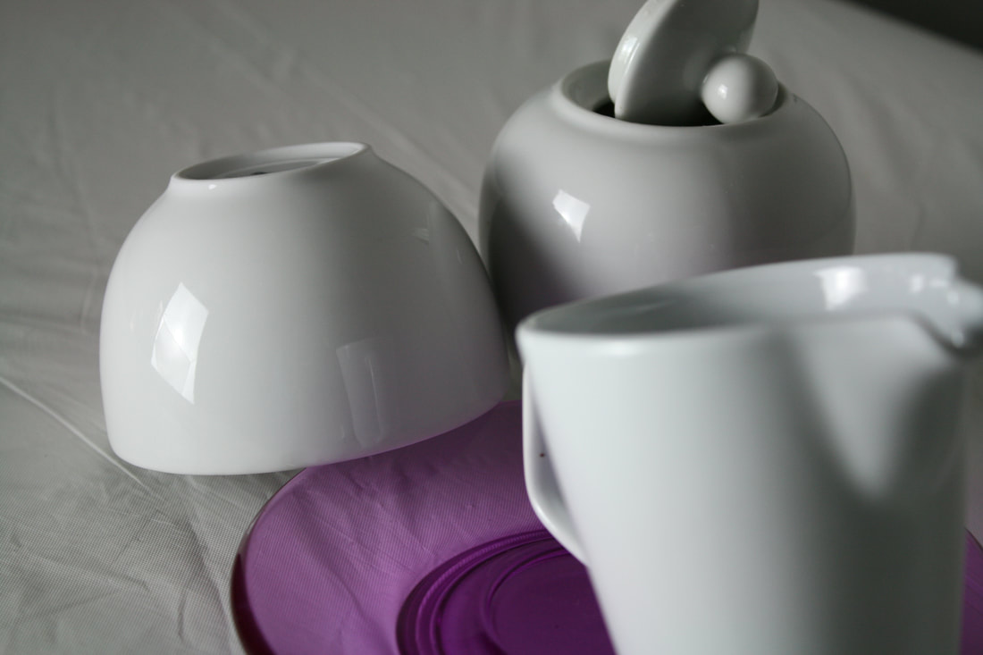
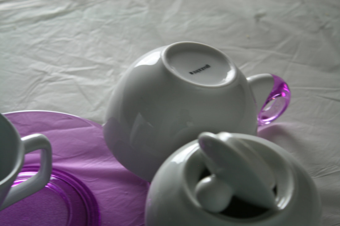
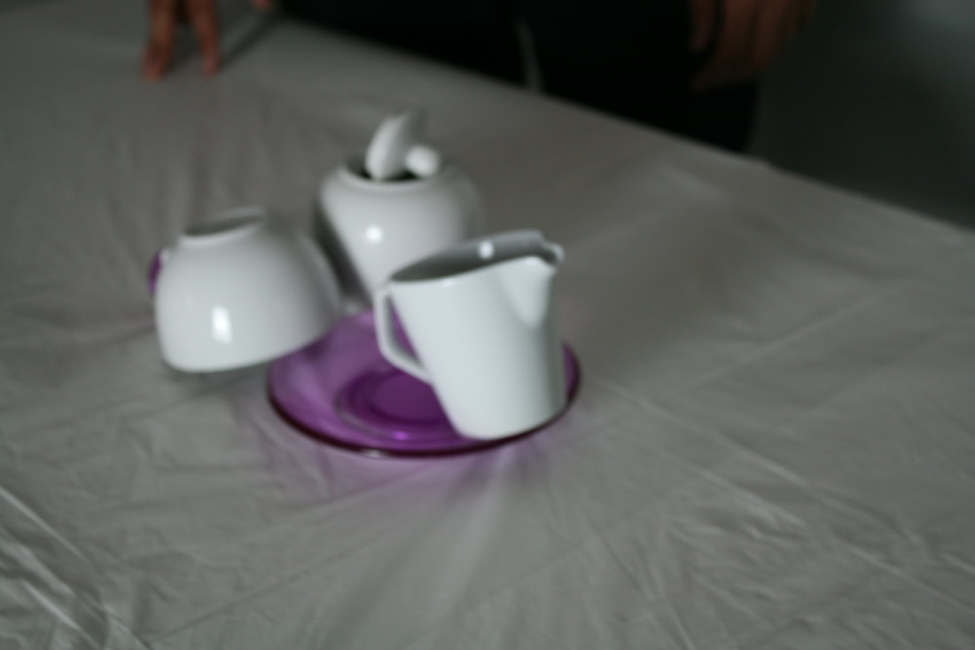
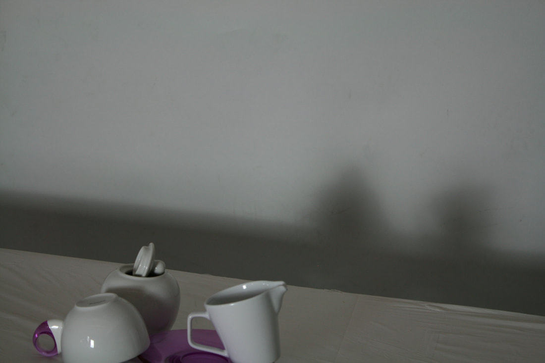
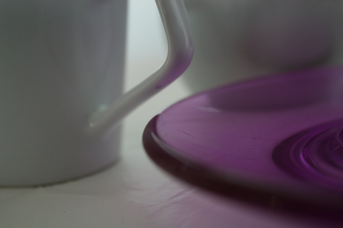
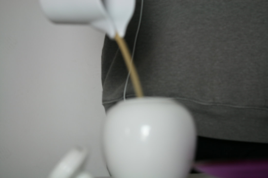
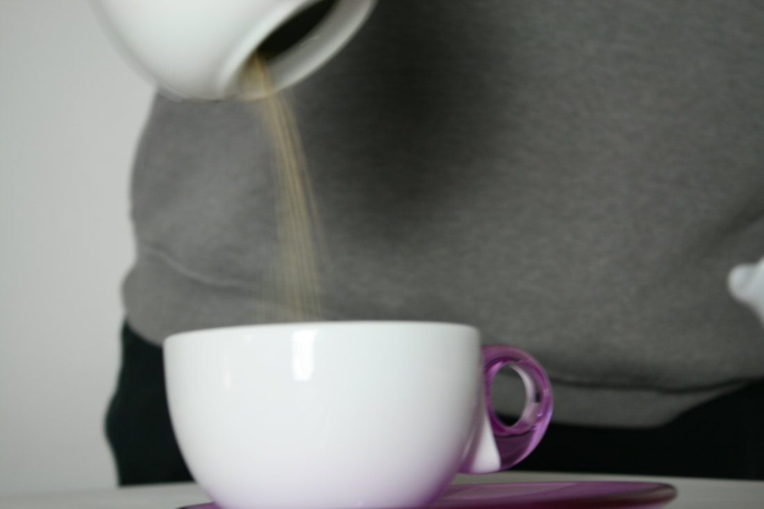
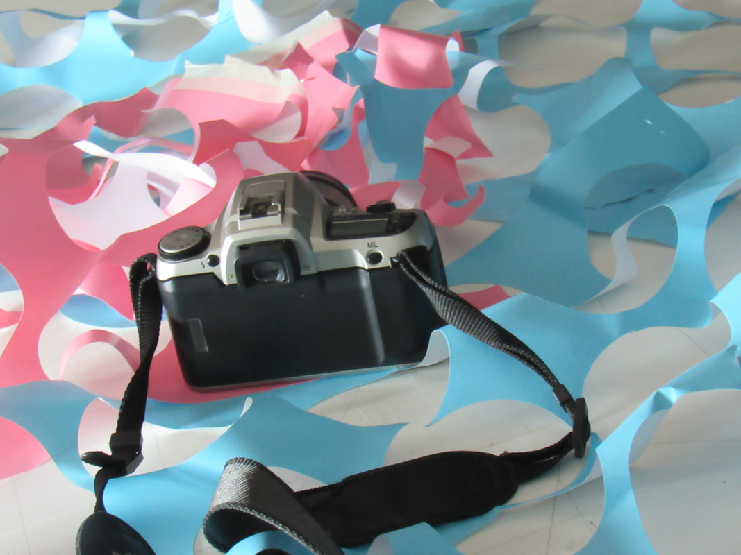
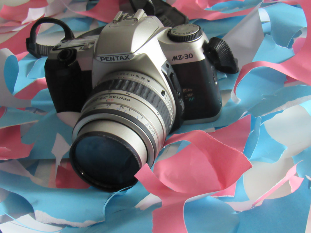
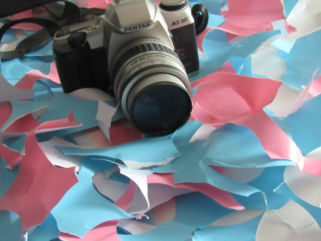
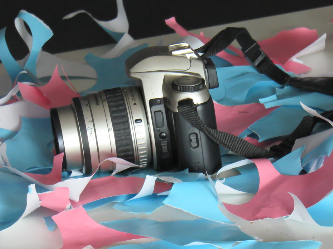
I thought that these images where very successful. I experimented for a while with lighting, shadows, depth of field and having other people in the background. The only part of this experiment I found difficult was trying to find new angles and trying to not make it look repetitive. The main thing I liked about this set up was that the subject had a splash of colour, contrasting with the white background.
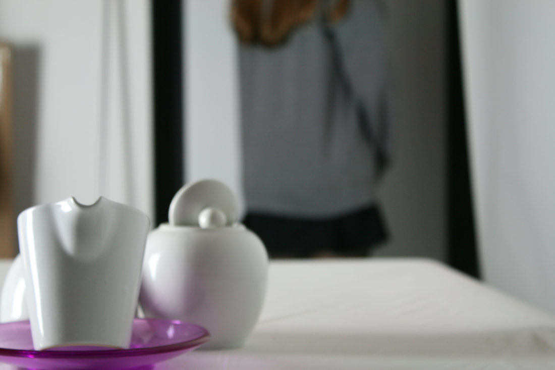
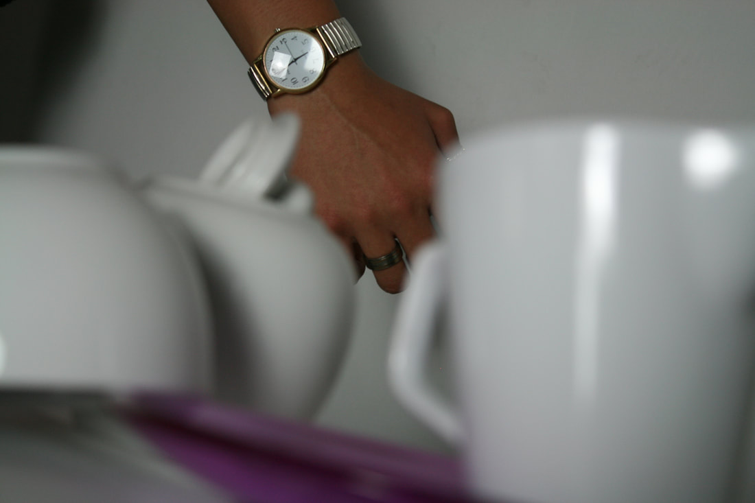
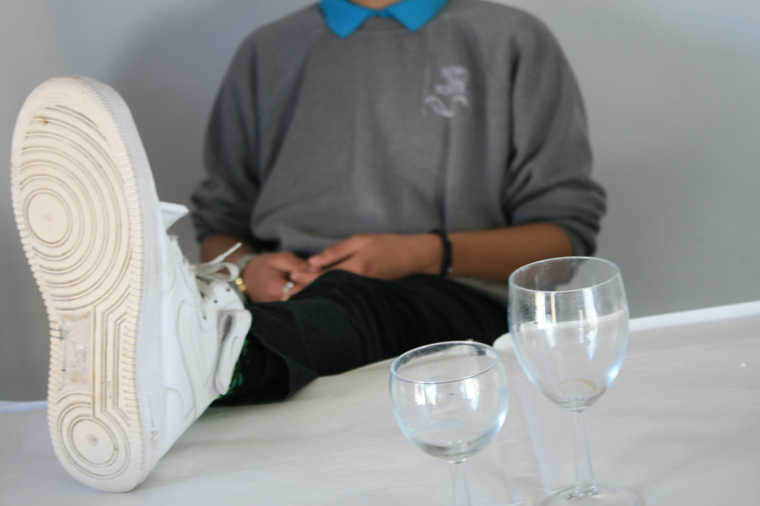
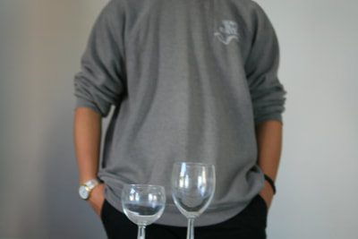
mOST SUCCESSFUL IMAGES
|
|
I thought that these were the most successful images in the set because I used depth of field, and I liked the way the background and the foreground merged. I also thought that having peoples hands in the background helped the pictures look more interesting, as I experimented with which one would be in focus.
|

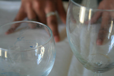
Second still life attempt
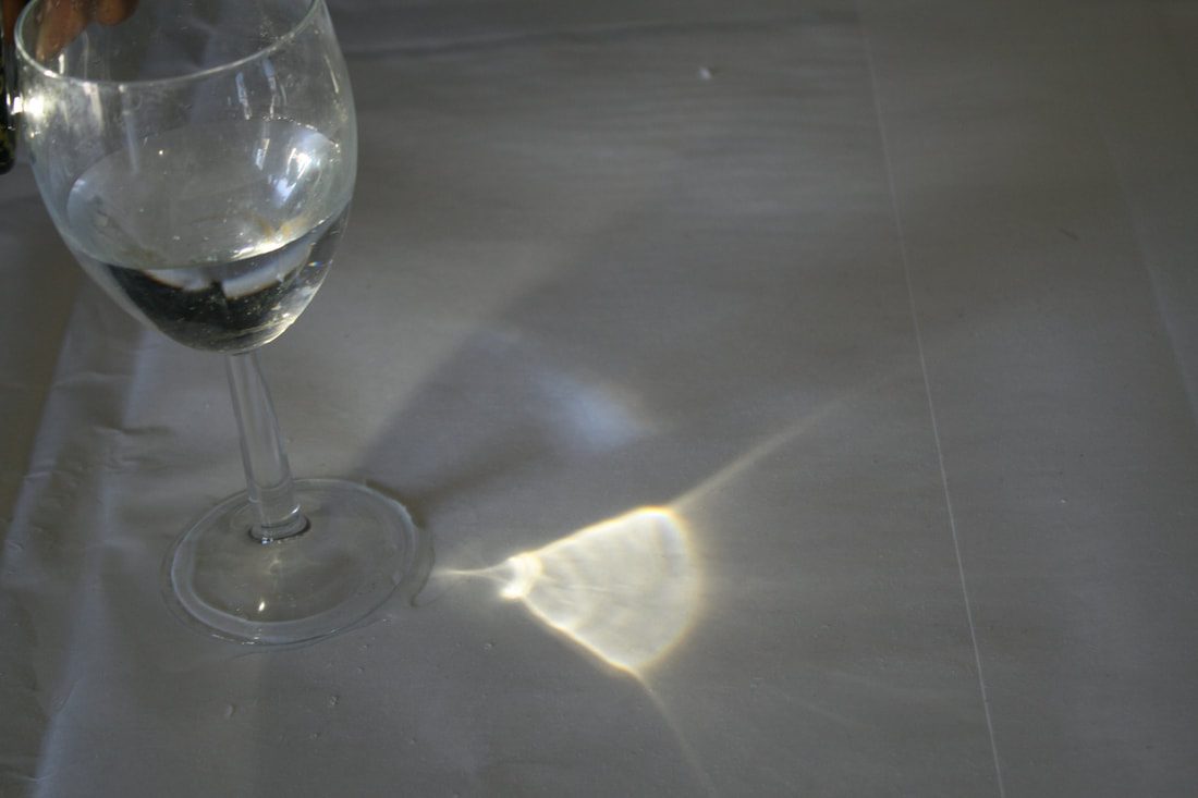
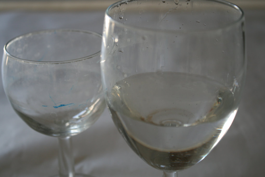
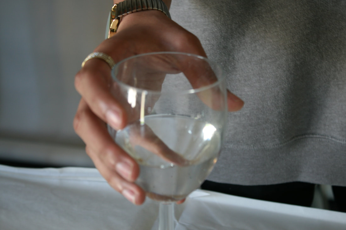
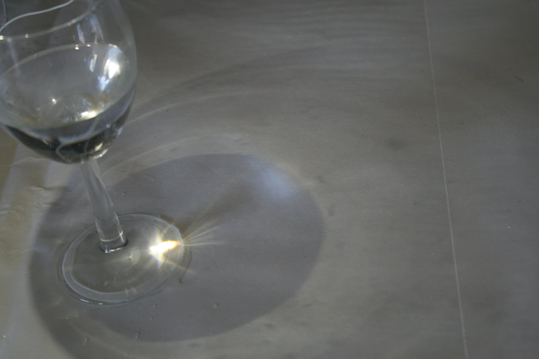
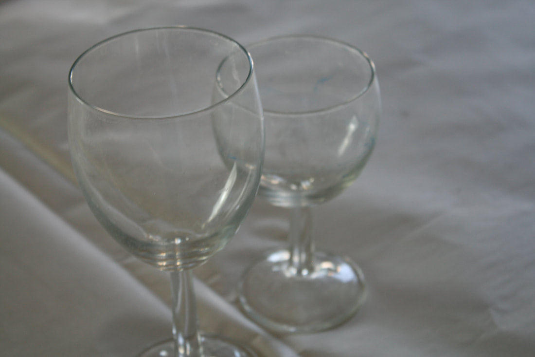
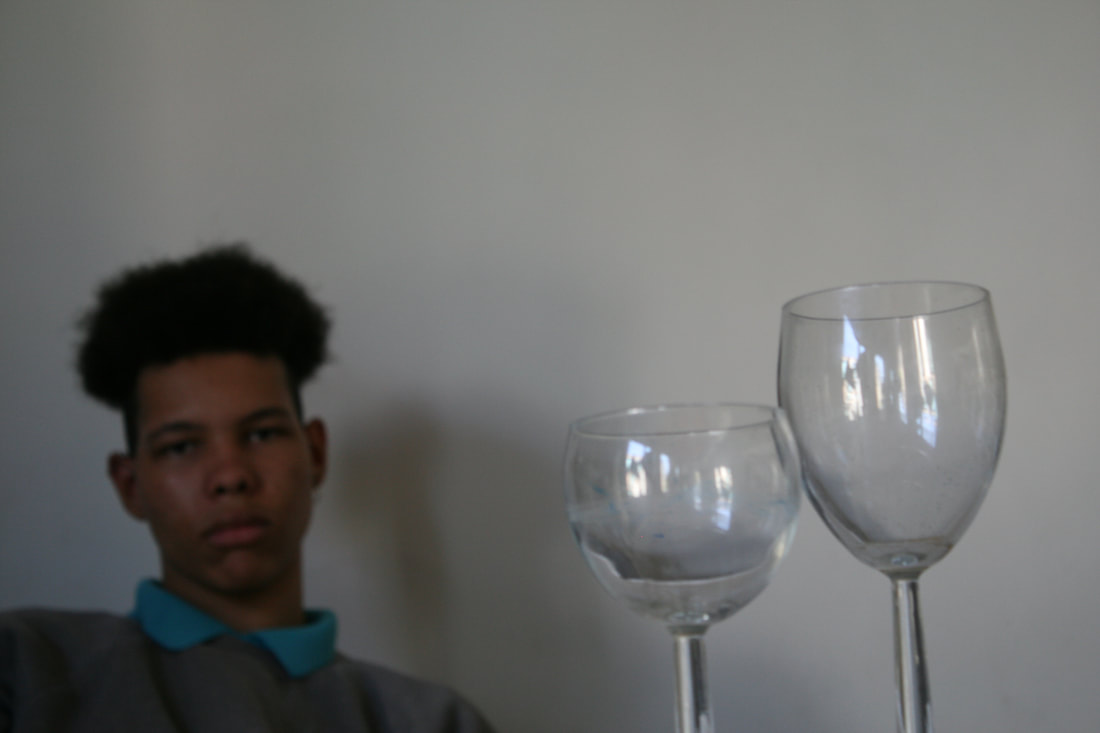
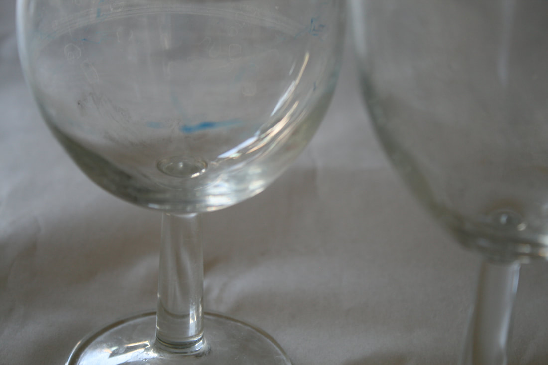
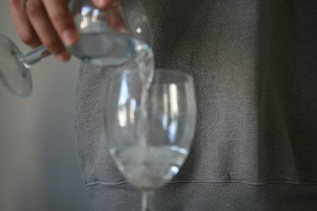
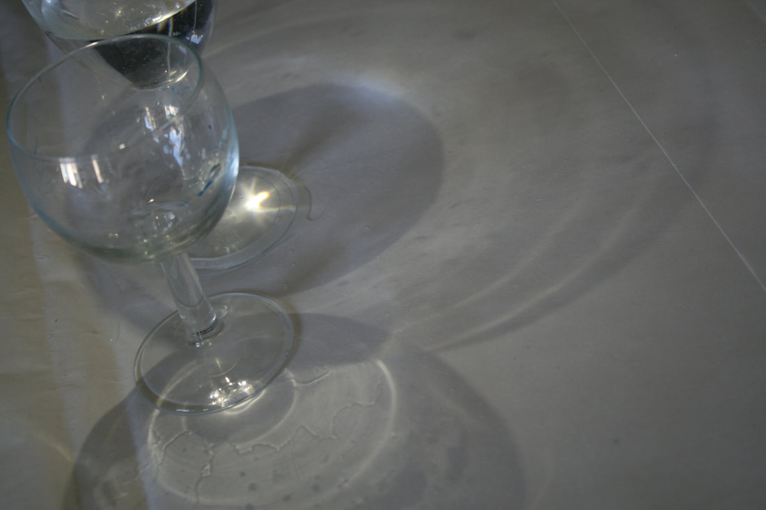
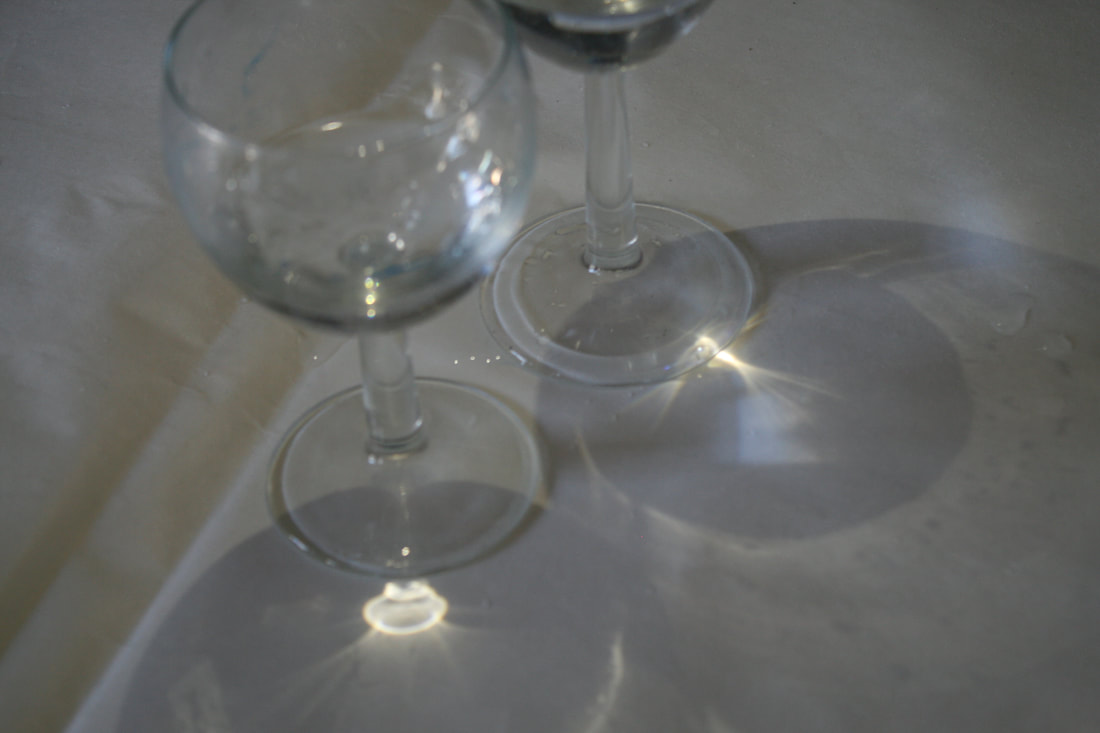
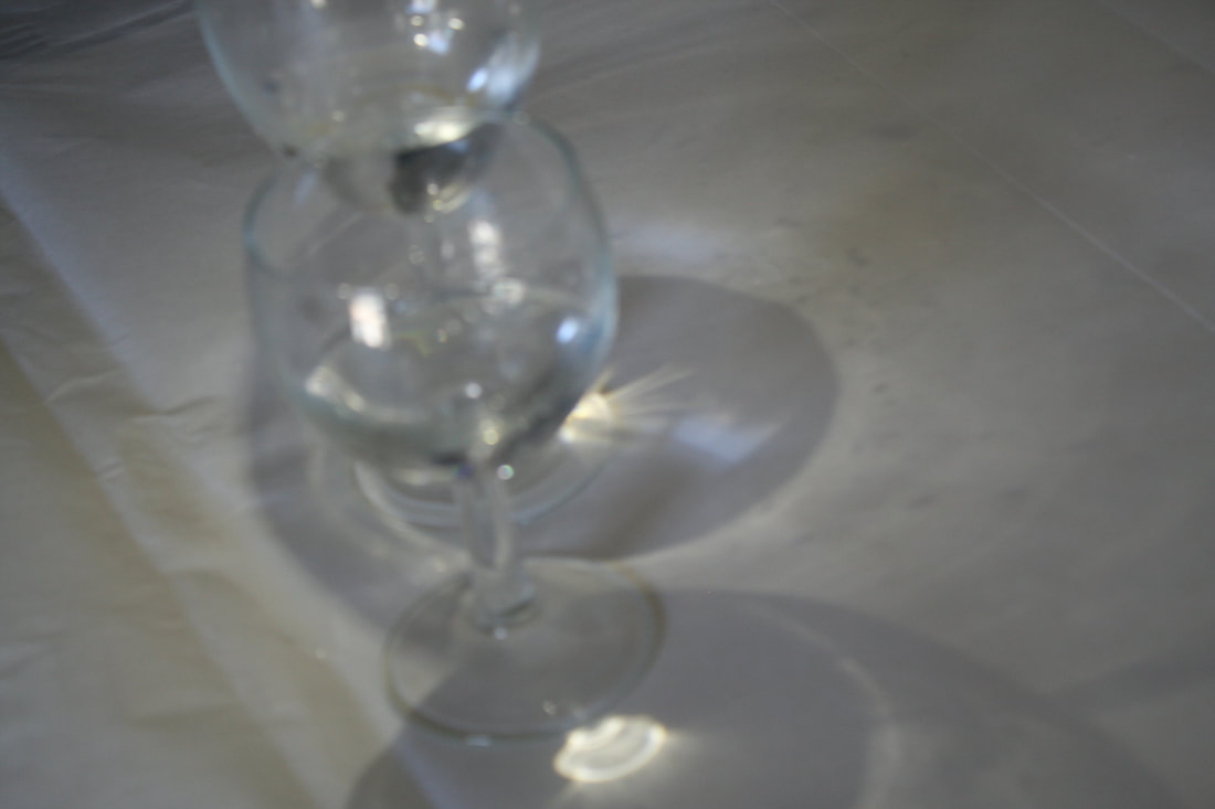
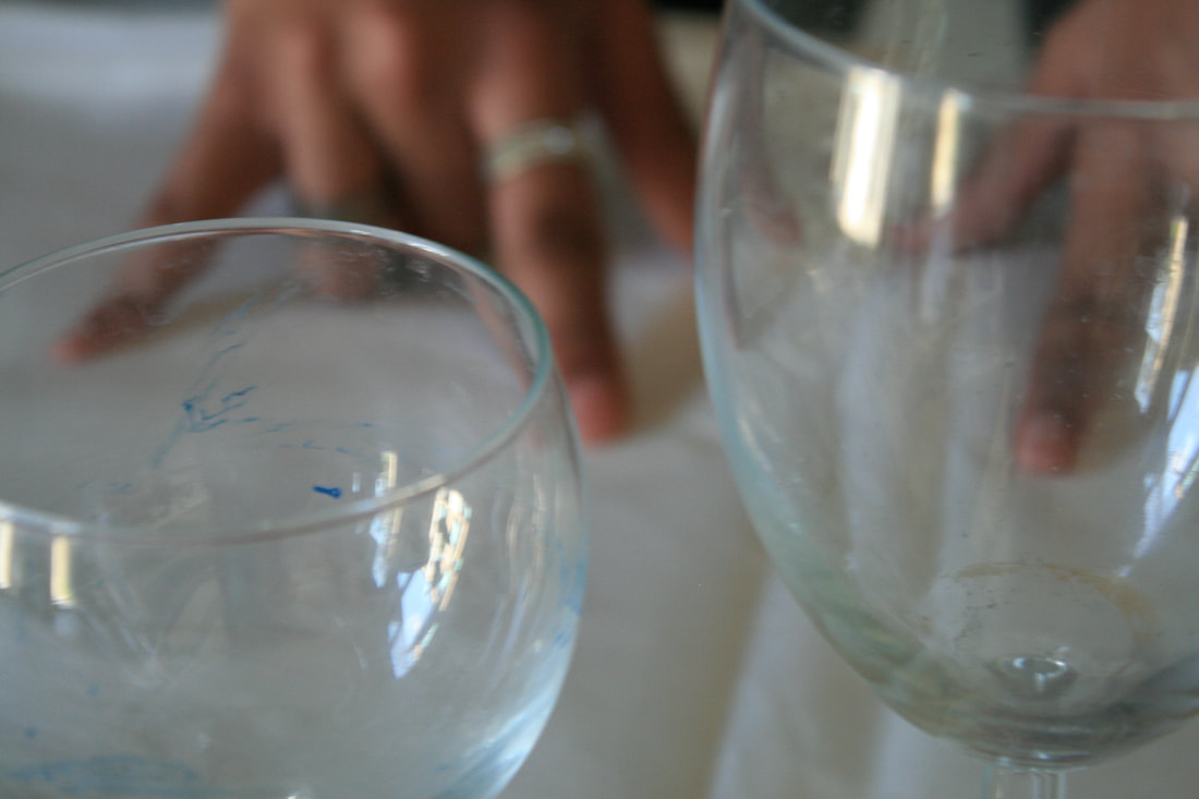
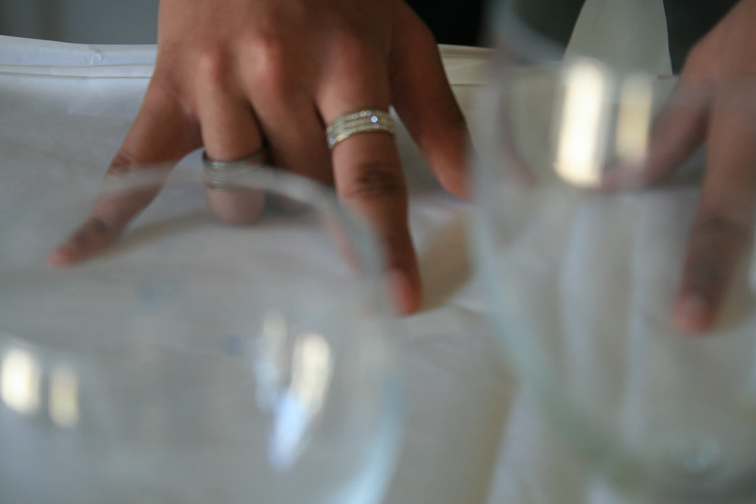
most successful images
|
|
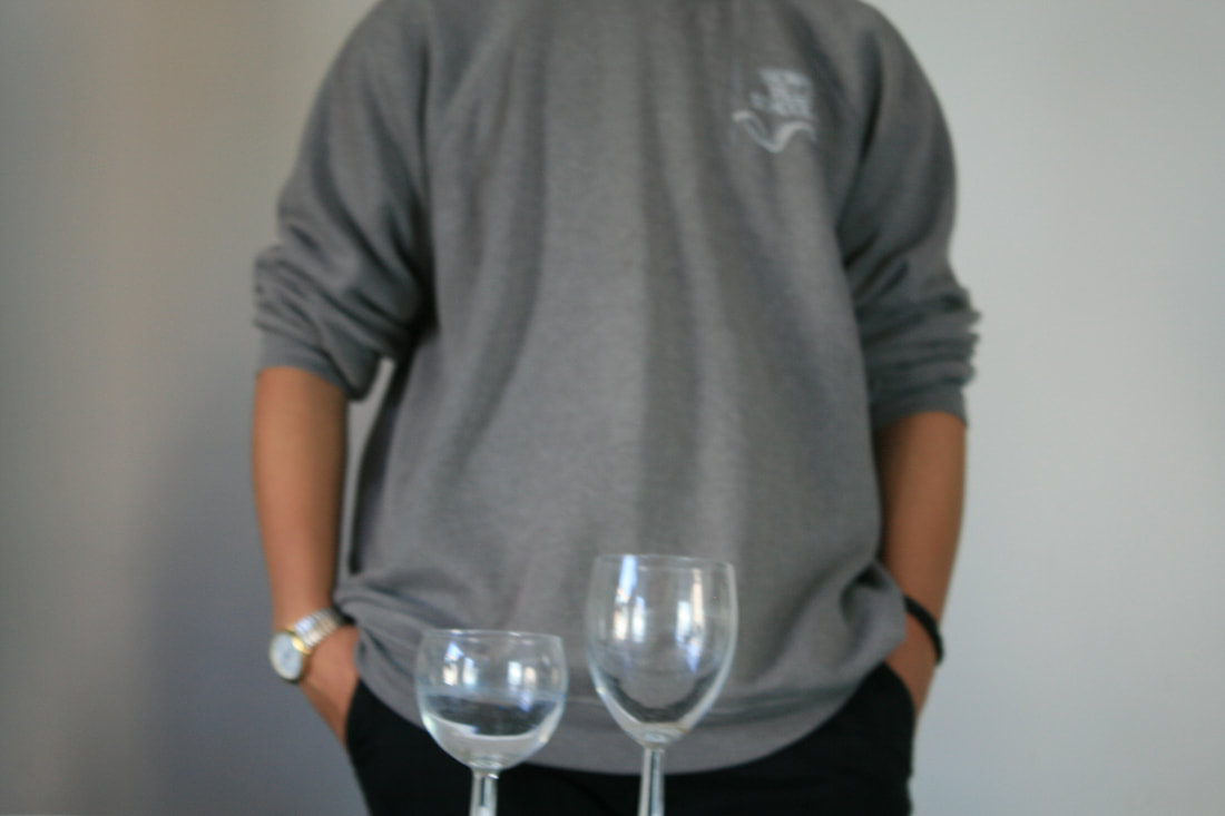
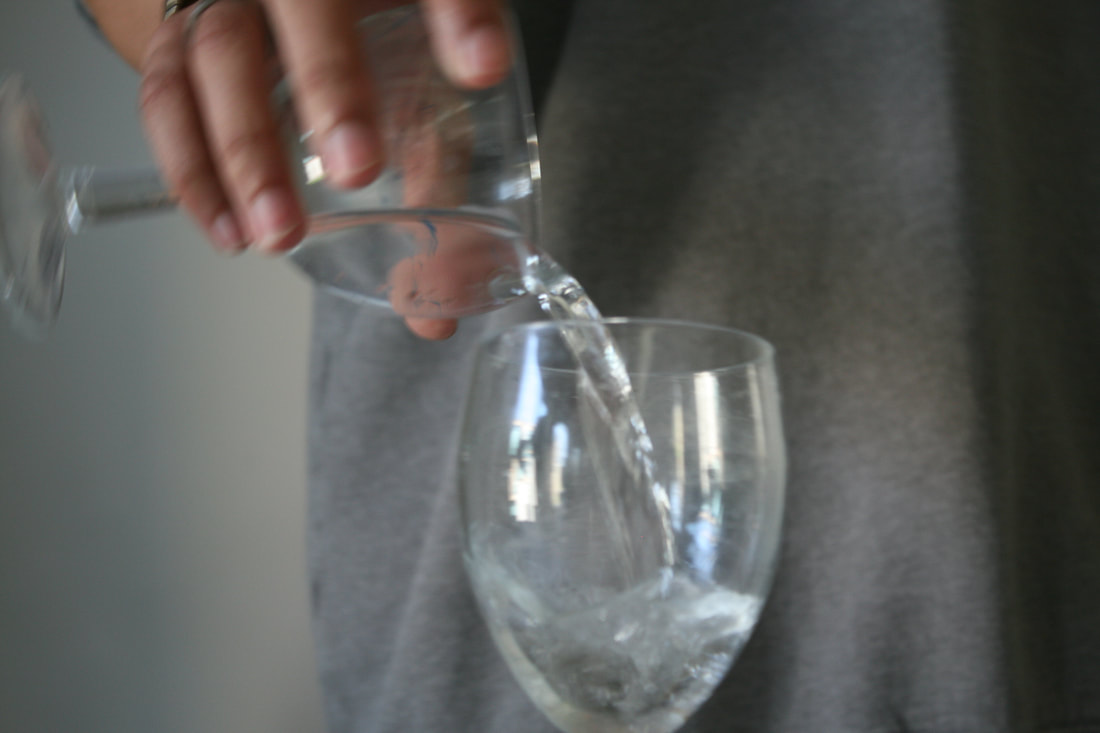
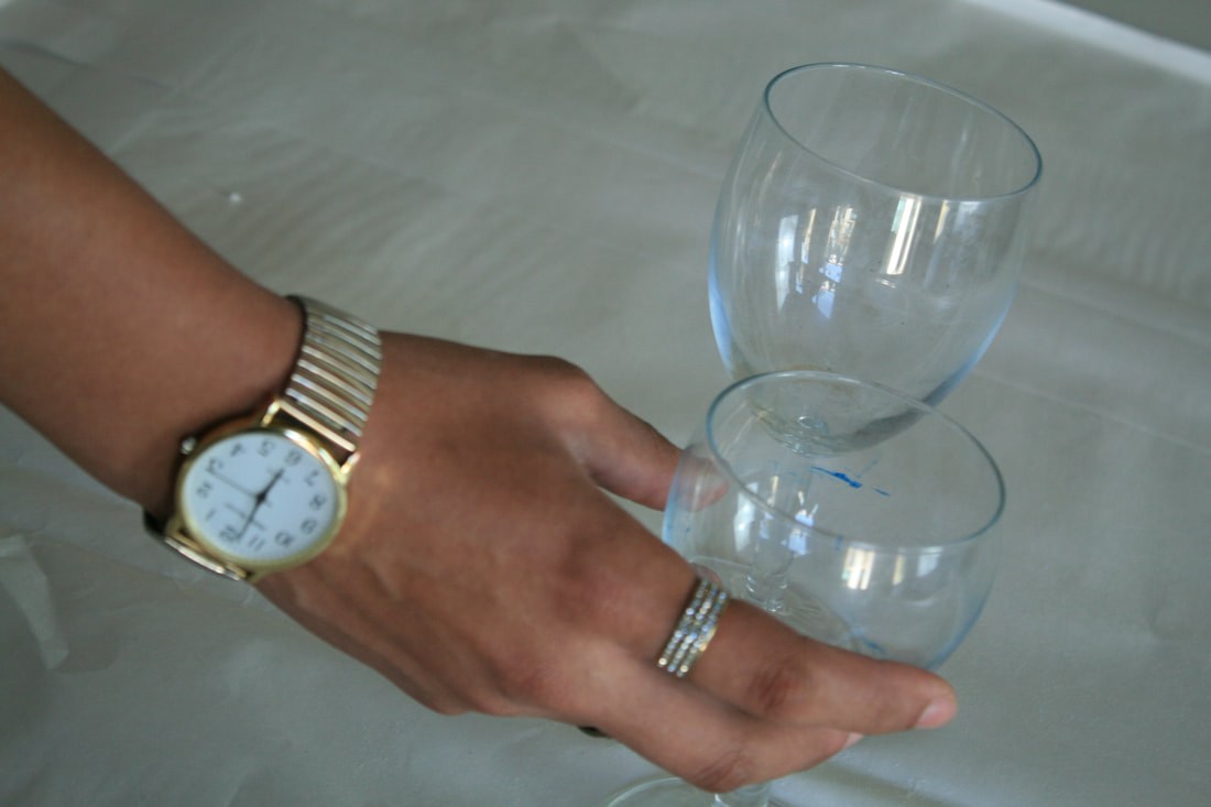
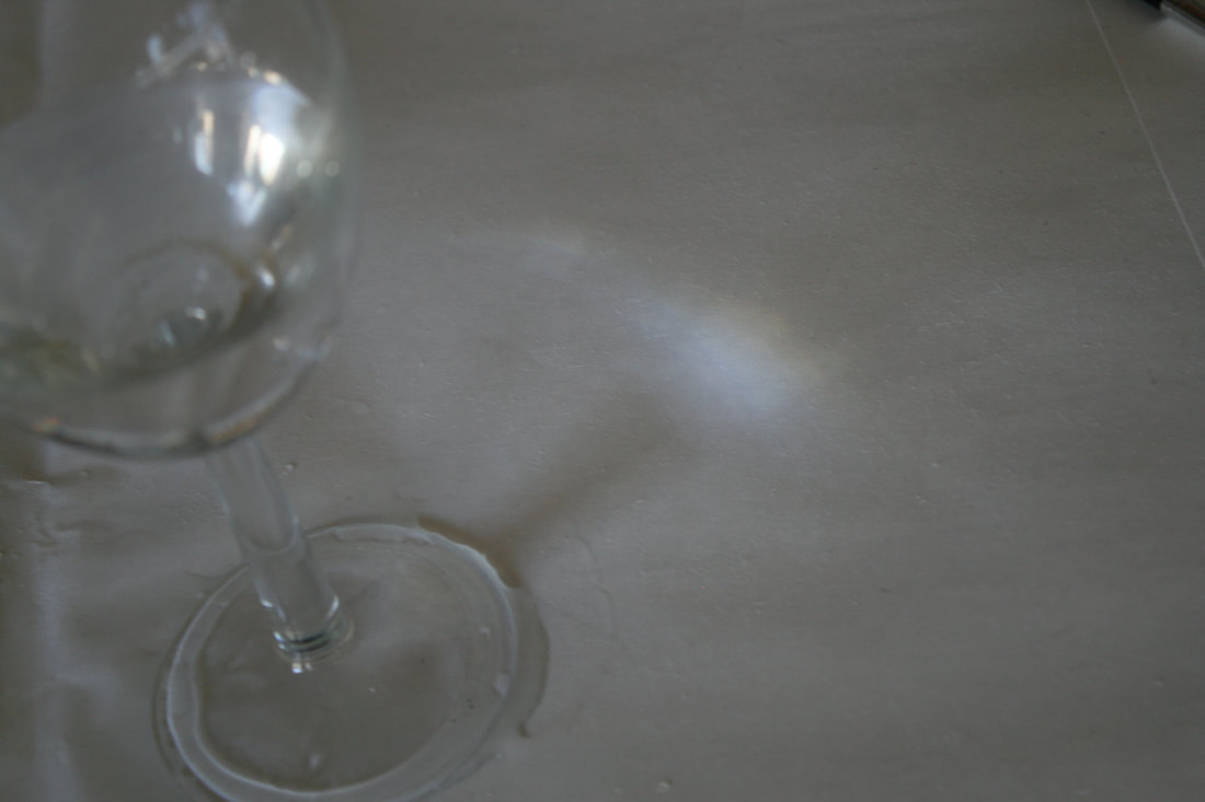
I thought that these were the most successful out of the set of images. I felt that the white table cloth, the white background and the clear glasses are a complete contrast from the dark skin of the model. I also found that I liked these a lot more than previous sets because of the natural daylight reflection off of the glasses and creating shadows on the model.
|


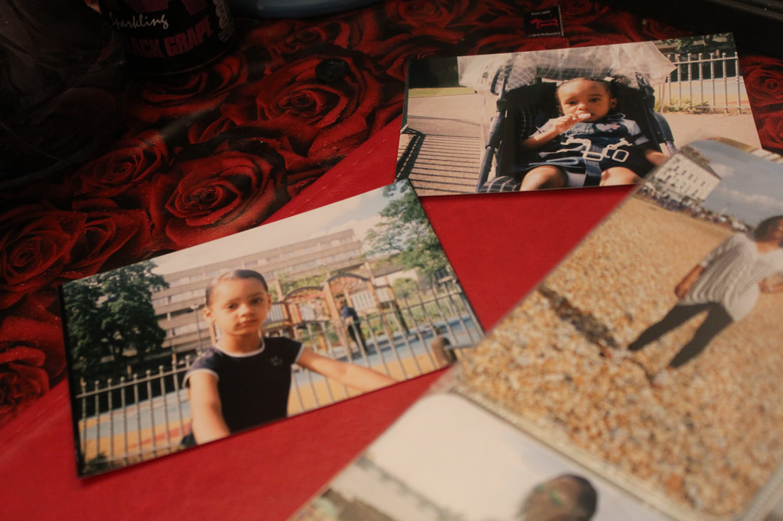
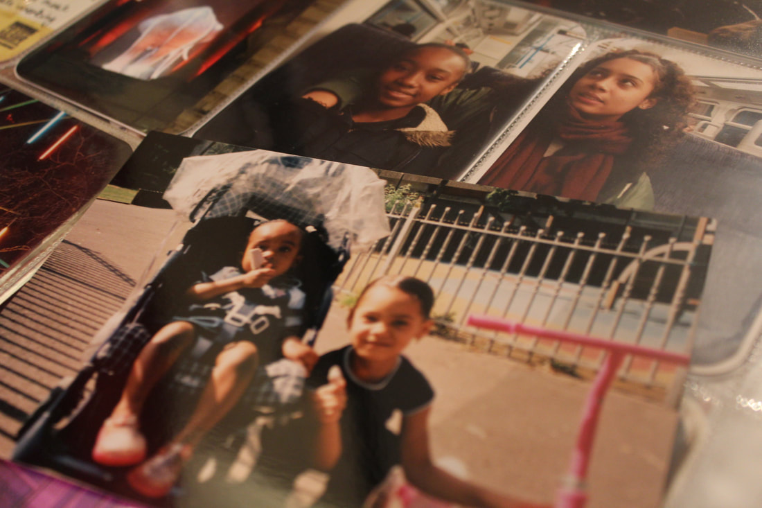
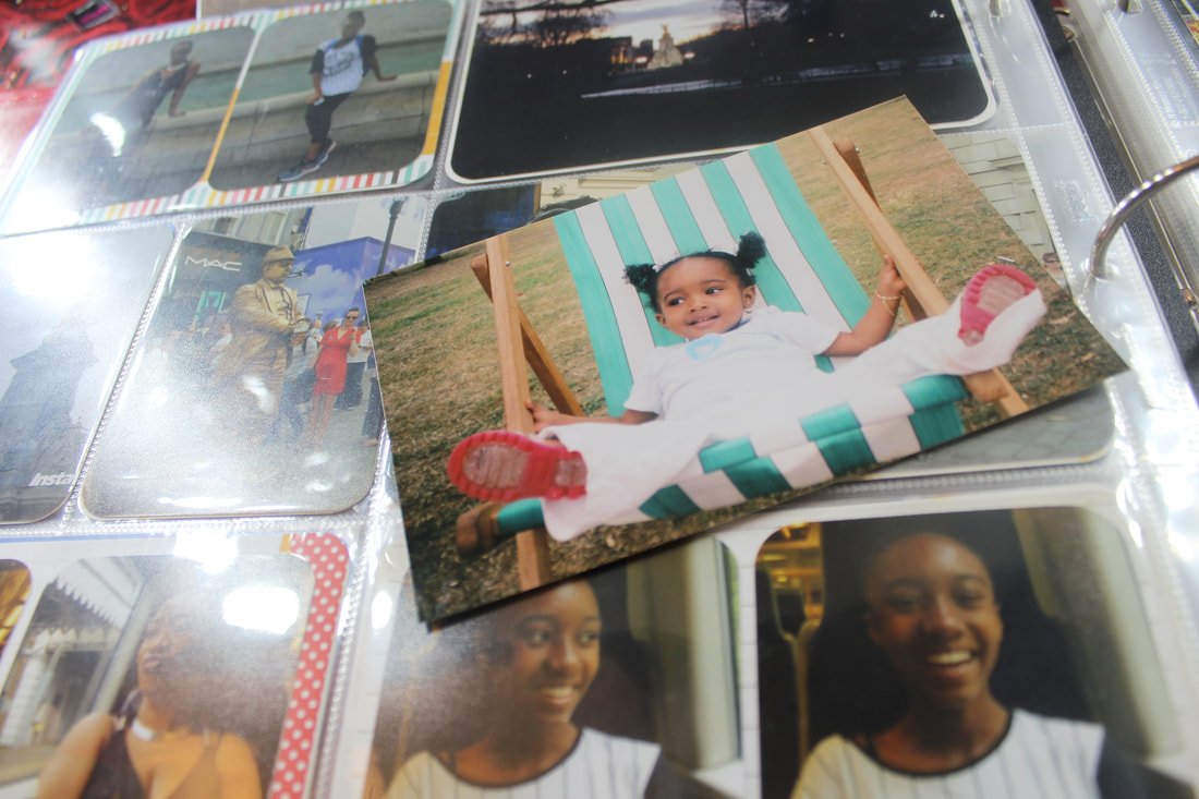
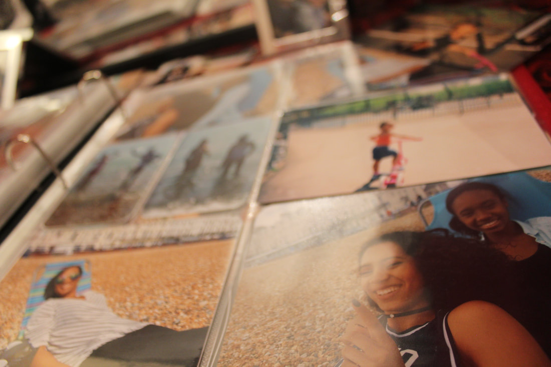
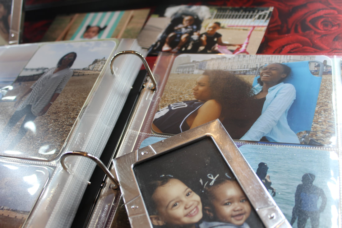
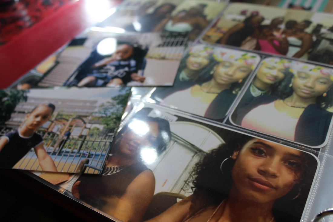
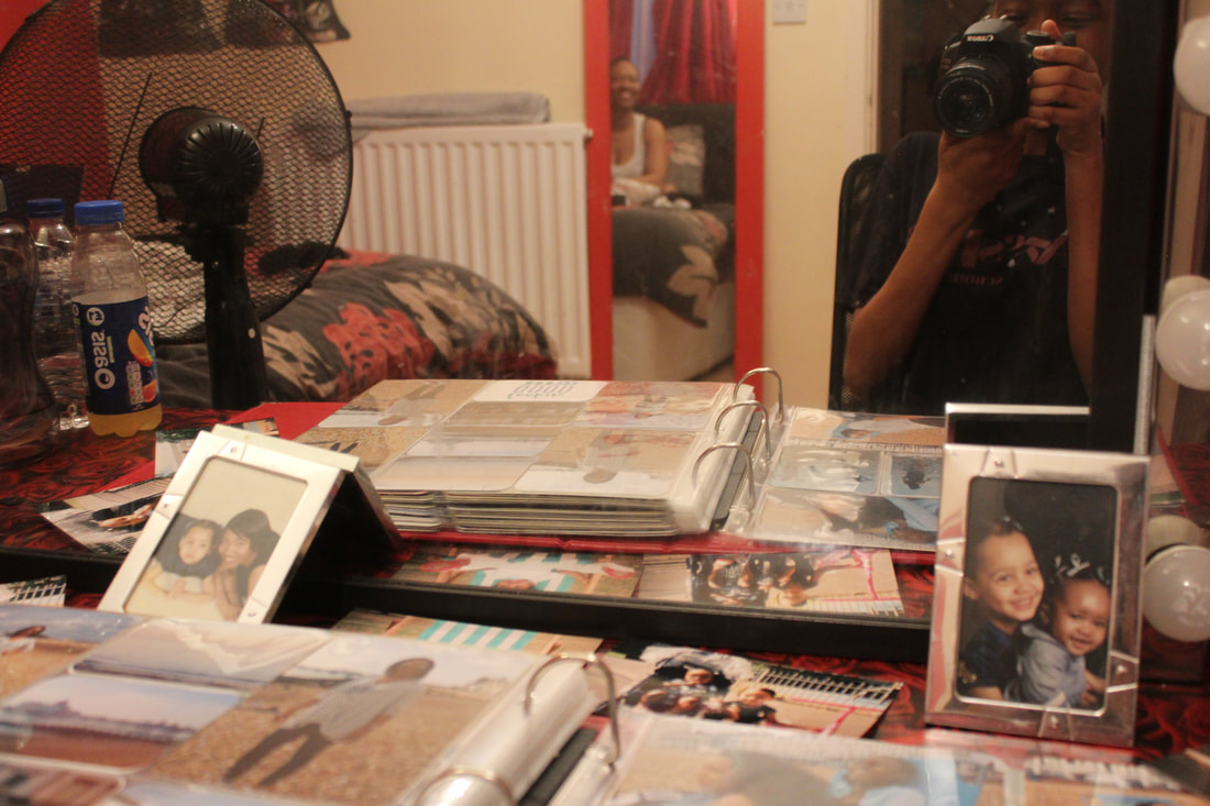
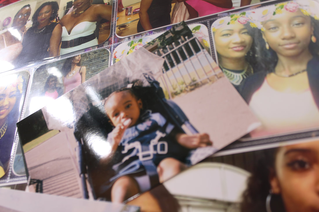
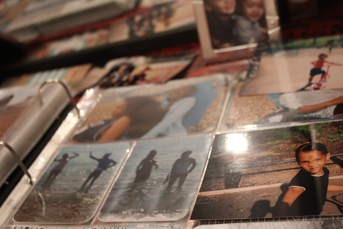
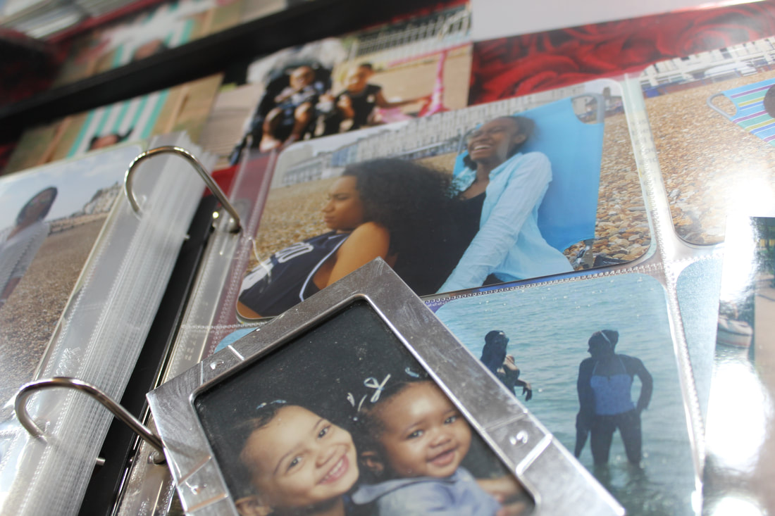
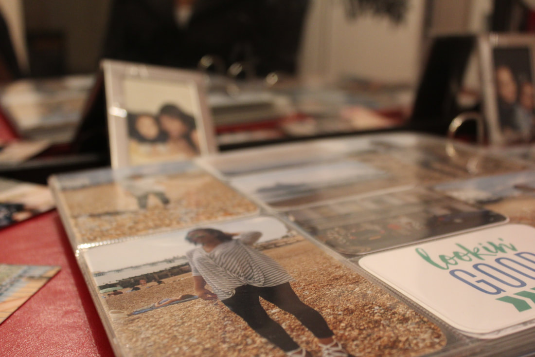
Still life attempt at home
I wanted to redo the still-life type images, but instead of having random objects with random people, I want to have a specific person with something that relates to them, and they can choose. I started by asking my mum what she thought was the most important thing in her life. Her answer was my sister and I, so I decided to gather pictures of us and laying them out over a table. I tried to get her into all of the pictures, but I didn't think it worked well with the idea of framing, and I thought the images looked to crowded. One reason I thought this didn't work was because the images are 2D and there is no person in the background. So it does not fully showcase my idea.
