Introduction to edges
|
|
This is a good example of pictures of edges. One interesting thing about these kinds of pictures is the fact that you can never see all of something when a picture is taken from the edge, you can't see the whole thing. My favourite pictures are when they are taken of buildings or of a particular piece of architecture.
I think edges will be a semi-interesting subject because there isn't anything unique about edges, and there isn't much freedom with the subject. |


FiRst edges task
|
|
Our task today was to take pictures all to do with edges. We had to start by writing a list of 30 possible things that had interesting edges. I missed the lesson to originally compile our list, so I had less time to take our pictures which resulted in me having a lot less pictures than I needed. I found this task challenging because the things I wrote down didn't look as good in the images as they did on paper (when I was writing my list). The best pictures that I took were the ones where I experimented with depth of field, because it helps the audience to focus on the edge. For that reason, I think the best picture of all is the one of the wooden bench because it isn't easy to tell what is behind it so you are kind of forced to look specifically at just the edges the bench.
|


Dolores Marat
|
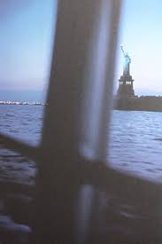
There are 6 images here taken by Dolores Marat. One theme of her images is the colour blue. Even though she uses it in different shades, it still has the same calming effect. In my opinion the calm colour makes the images much nicer to look at. I think the nicest image here to look at is the one of the river with the statue of liberty in the top right corner. I like it because even though the statue is extremely cropped, you can still tell where it is and can imagine where the photographer was when they took the picture. Marat uses quite a simple composition in her images.
This is the best picture from Marat, in my opinion. I think the colour is really nice to look at, which makes it more appealing to a viewer. i think the way Marat took the picture is quite unique because, although the subject of the picture is the pole, the audience is automatically drawn to the statue of liberty because its more colourful and is more familiar to the audience.
|


Todays task
|
|
Here is a series of images taken by Jan Groover. One thing Groover pays a lot of attention to is the composition in her images, this makes it interesting because she takes something as mundane as silverware and making it interesting because of all of the different angles at which she puts them. Another thing I like about this artist is the colour, as it is all very similar and would be easy to make a gallery.
1. They photograph utensils 2. They photograph in Black and White 3. They take close-ups 4. They use artificial lighting and make it unique. 5. They photograph at unusual angles. |


My recreations
|
|
In todays lesson I recreated Jan Groover's images, using drawing pins instead of cutlery because I didn't have any. All of my pictures had quite a random composition because I pushed them around after every picture I took. My pictures were quite bright, so I had to edit them to be black and white, as well as cropping them to make sure they were all the same size and were close to the subject, like Groover's images. Another key component of Jan Groover's gallery is that the cutlery is quite shiny, so I wanted to use something shiny to recreate them as closely as possible, without completely copying them.
|


Dolores marat inspired
|
|
I took these pictures looking for splashes of colour and angles that were unusual and interesting to me. I took every picture at an extreme angle which meant the I had
|


EdITED VERSION


Final piece Research
|
|
I looked for artists that specifically used colour splashes in their photography and I found some people on pinterest such as Lynne Pelner and Alex Koloskov. I thought it was an interesting concept, as I took these pictures from Google and Pinterest, and thought they were inspiring for my piece. I have decided I wanted to take separate pictures instead of editing colour onto a Black and White picture because I don't know how, but I feel it will have a better, more authentic outcome.
I also found an artist named Daniel Janda, who does colour splashes using paint, in a grunge- style. I think I want my pictures to have the same colour pop as his paintings.
|


|
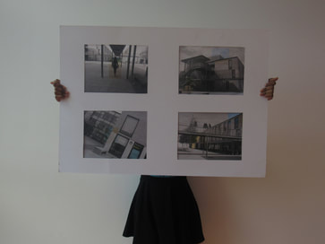
For my final piece, I decided to take pictures of different things, in Black and White, and then in colour to cut out the edges and stick them over each other. I later decided to take more pictures of buildings (and have less pictures of people), because it showed the edges better and was just cleaner in general. I then mounted my pictures for a quicker and nicer way to access them. I wanted to explore the theme of colours, and the different ways I could make the colours pop, as well as lining up the edges of the first picture with the second, ensuring they matched.
This is my final piece, finished and mounted. I ended up scrapping majority of my original pictures and picking the four best pictures to mount and photograph, mostly the ones of buildings. While creating the first few pictures, I experimented with cutting out different shapes, but I preferred to have a simple square or rectangular cutout. I found most of this quite easy, so I know for next time that I need to challenge myself more and get out of my comfort zone.
|


